
Как подчеркнуть текст в css
Свойство text — decoration позволяет добавить декоративные линии тексту. Текст можно подчеркнуть, перечеркнуть или добавить линию над текстом.
text — decoration : underline часто встречается при работе со ссылками.
Пример
Создадим четыре абзаца текста. По одному для каждого из доступных значений свойства text — decoration .
Как понять
По факту свойство text — decoration является шорткатом и позволяет указать значения для свойств:
-
— положение декоративной линии; — стиль декоративной линии; — цвет декоративной линии.
Но, как правило, его используют только для указания положения линии.
Как пишется
Положение линии
Пишем свойство text — decoration и после двоеточия указываем одно из доступных значений:
- underline — подчёркнутый текст.
- line — through — перечёркнутый текст.
- overline — надчёркнутый текст, линия находится над словами.
- none — отменяет все эффекты.
Выше указаны стандартные значения, с которыми вы будете сталкиваться чаще всего.
Стиль линии
Не многие знают, что после ключевого слова, означающего положение линии, можно указать ещё и стиль этой линии и её цвет.
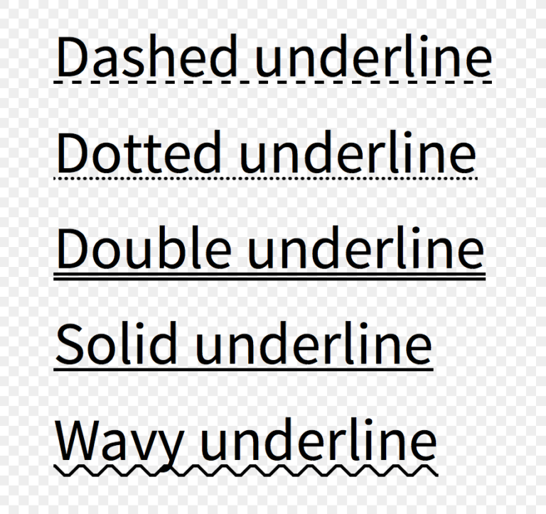
Для управления стилем линии используются следующие ключевые слова:
- solid — сплошная линия. Значение по умолчанию.
- double — двойная линия.
- dotted — точечная линия.
- dashed — пунктирная линия.
- wavy — волнистая линия.
Управлять стилем подчёркивания обычно не требуется, но об этой возможности знать нужно.
Как будет выглядеть двойное перечёркивание:
Стиль линии можно указать отдельно при помощи свойства text — decoration — style .
Цвет линии
Цвет линии по умолчанию совпадает с цветом текста, для которого задаётся свойство text — decoration .
Мы можем изменить это значение, указав после ключевых слов типа и стиля линии код цвета в любом доступном в вебе формате.
Например, сделаем двойное подчёркивание красного цвета:
Цветом линии можно управлять отдельно при помощи свойства text — decoration — color :
Подсказки
�� Свойство не наследуется.
�� Значение по умолчанию для обычного текста — none . Но для ссылок ( ) значение по умолчанию — underline .
�� Свойство text — decoration целиком нельзя анимировать при помощи свойства transition ��
Но можно анимировать цвет линии!
Пусть по умолчанию цвет линий будет совпадать с цветом текста, а по наведению курсора цвет будет меняться на другой за 0.3 секунды.
�� Нельзя управлять толщиной и точным положением линии, заданной при помощи text — decoration .
�� Если по дизайну требуется задать тексту или ссылке подчёркивание, отличающееся от стандартного по толщине или положению, а также если нужно анимировать появление / пропадание линии, то используй псевдоэлементы : : before или : : after .
На практике
Егор Левченко советует
�� Иногда вам может потребоваться управлять расстоянием между текстом и линией ниже. Обычно это делается, через свойство line — height . Чем больше высота строки, тем ниже будет полоса подчёркивания.
К сожалению, этот способ подходит не всегда. Например, когда дизайнер задумал элемент несколько иначе. На примере ниже отказываемся от text — decoration и используем border — bottom .
Алёна Батицкая советует
�� У ссылок по умолчанию задано подчёркивание. Если по дизайну оно не требуется, то нужно будет его сбросить — задать свойство text — decoration : none . Это самый частый случай применения этого свойства. Перечёркивание или надчёркивание почти не встречаются в работе.
�� Отдельные свойства — text — decoration — line , text — decoration — style и text — decoration — color — редко встречаются в вёрстке, но знать о них нужно, чтобы при необходимости не переписывать свойство целиком только для изменения стиля или цвета линии.
CSS Text Decoration Module Level 3
This module contains the features of CSS relating to text decoration, such as underlines, text shadows, and emphasis marks.
CSS is a language for describing the rendering of structured documents (such as HTML and XML) on screen, on paper, etc.
Status of this document
This section describes the status of this document at the time of its publication. A list of current W3C publications and the latest revision of this technical report can be found in the W3C technical reports index at https://www.w3.org/TR/.
This is a draft document and may be updated, replaced or obsoleted by other documents at any time. It is inappropriate to cite this document as other than work in progress.
Please send feedback by filing issues in GitHub (preferred), including the spec code “css-text-decor” in the title, like this: “[css-text-decor] …summary of comment…”. All issues and comments are archived. Alternately, feedback can be sent to the (archived) public mailing list www-style@w3.org.
This document was produced by a group operating under the W3C Patent Policy. W3C maintains a public list of any patent disclosures made in connection with the deliverables of the group; that page also includes instructions for disclosing a patent. An individual who has actual knowledge of a patent which the individual believes contains Essential Claim(s) must disclose the information in accordance with section 6 of the W3C Patent Policy.
The following features are at-risk, and may be dropped during the CR period:
- The ability to place both emphasis marks and ruby on the same base text.
“At-risk” is a W3C Process term-of-art, and does not necessarily imply that the feature is in danger of being dropped or delayed. It means that the WG believes the feature may have difficulty being interoperably implemented in a timely manner, and marking it as such allows the WG to drop the feature if necessary when transitioning to the Proposed Rec stage, without having to publish a new Candidate Rec without the feature first.
1. Introduction
This subsection is non-normative.
This module covers text decoration, i.e. decorating the glyphs of the text once typeset according to font and typographic rules. (See [CSS-TEXT-3] and [CSS-FONTS-3].) Such features are traditionally used not only for purely decorative purposes, but also in some cases to show emphasis, for honorifics, and to indicate editorial changes such as insertions, deletions, and misspellings.
CSS Levels 1 and 2 only defined very basic line decorations (underlines, overlines, and strike-throughs) appropriate to Western typographical traditions. Level 3 of this module adds the ability to change the color, style, position, and continuity of these decorations, and also introduces emphasis marks (traditionally used in East Asian typography), and shadows (which were proposed then deferred from Level 2).
1.1. Module Interactions
This module replaces and extends the text-decorating features defined in [CSS2] chapter 16.
1.2. Value Definitions
This specification follows the CSS property definition conventions from [CSS2] using the value definition syntax from [CSS-VALUES-3]. Value types not defined in this specification are defined in CSS Values & Units [CSS-VALUES-3] . Combination with other CSS modules may expand the definitions of these value types.
In addition to the property-specific values listed in their definitions, all properties defined in this specification also accept the CSS-wide keywords as their property value. For readability they have not been repeated explicitly.
1.3. Terminology
The terms character, letter, and content language as used in this specification are defined in [CSS-TEXT-3]. Other terminology and concepts used in this specification are defined in [CSS2] and [CSS-WRITING-MODES-4].
2. Line Decoration: Underline, Overline, and Strike-Through
The following properties describe line decorations that are added to the content of an element. When specified on or propagated to an inline box, that box becomes a for that decoration, applying the decoration to all its fragments. The decoration is then further propagated to any in-flow block-level boxes that split the inline (see CSS2.1 section 9.2.1.1). When specified on or propagated to a block container that establishes an inline formatting context, the decorations are propagated to an anonymous inline box that wraps all the in-flow inline-level children of the block container . When specified on or propagated to a ruby container, the decorations are propagated only to the ruby base. For all other box types, the decorations are propagated to all in-flow children.
Note that text decorations are not propagated to any out-of-flow descendants, nor to the contents of atomic inline-level descendants such as inline blocks and inline tables. They are also not propagated to inline children of inline boxes, although the decoration is applied to such boxes.
Underlines, overlines, and line-throughs are drawn only for non-replaced inline boxes, and are drawn across all text (including white space, letter spacing, and word spacing) except spacing (white space, letter spacing, and word spacing) at the beginning and end of a line. Atomic inlines, such as images and inline blocks, are not decorated. Margins, borders, and padding of the decorating box are always skipped, however the margins, border, and padding of descendant inline boxes are not.
Note that CSS 2.1 required skipping margins, borders, and padding always. In this level, by default only the margins, borders, and padding of the decorating box are skipped. In the future CSS2.1 may be updated to match this new default. Also, control over decorating leading/trailing spaces is expected in Level 4, and will be applied by default to the HTML ins and del elements.
UAs may interrupt underlines and overlines where the line would cross glyph ink and to some distance to either side of the glyph outline; this behavior is not controllable in this level, but will be further defined in Level 4. Line-throughs must remain continuous, however.
Skipping Glyph Ink
When the UA interrupts underlines or overlines at glyph boundaries, the shape of the line at that boundary should follow the shape of the glyph.
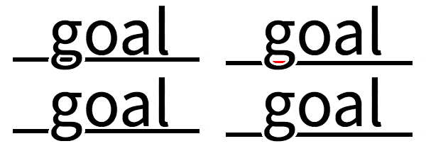
Hiding the portion of the underline within the bowl gives a cleaner look to the type, while the curved ends of the underline outside it suggest the continuity of the underline through the letter by hugging its outer contour.
Relatively positioning a descendant moves all text decorations applied to it along with the descendant’s text; it does not affect calculation of the decoration’s initial position on that line. The visibility property, text-shadow, filters, and other graphical transformations likewise also affect all text decorations applied to that box— including decorations propagated from an ancestor box— and do not affect the calculation of their initial positions or thicknesses. (In the case of line decorations drawn over an atomic inline or across the margins/borders/padding of a non-replaced inline box, they are analogously associated with the affected atomic inline / non-replaced inline box rather than with the decorating box.)
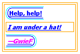
. the underlining for the blockquote element is propagated to an anonymous inline box that surrounds the span element, causing the text «Help, help!» to be blue, with the blue underlining from the anonymous inline underneath it, the color being taken from the blockquote element. The text in the em block is also underlined, as it is in an in-flow block to which the underline is propagated. The final line of text is fuchsia, but the underline underneath it is still the blue underline from the anonymous inline element. This diagram shows the boxes involved in the example above. The rounded aqua line represents the anonymous inline element wrapping the inline contents of the paragraph element, the rounded blue line represents the span element, and the orange lines represent the blocks.
Note: Line decorations are propagated through the box tree, not through inheritance, and thus have no effect on descendants when specified on an element with display: contents.
2.1. Text Decoration Lines: the text-decoration-line property
Specifies what line decorations, if any, are added to the element. Values have the following meanings:
Neither produces nor inhibits text decoration. Each line of text is underlined. Each line of text has a line over it (i.e. on the opposite side from an underline). Each line of text has a line through the middle. The text blinks (alternates between visible and invisible). Conforming user agents may simply not blink the text. Note that not blinking the text is one technique to satisfy checkpoint 3.3 of WAI-UAAG. This value is deprecated in favor of Animations [CSS-ANIMATIONS-1].
Note: In vertical writing modes, text-underline-position can cause the underline and overline to switch sides. This allows the position of underlines to key off of language-specific preferences automatically.
2.2. Text Decoration Style: the text-decoration-style property
This property specifies the style of the line(s) drawn for text decoration specified on the element. Values have the same meaning as for the border-style properties [CSS-BACKGROUNDS-3]. wavy indicates a wavy line.
The style of text decorations must remain the same on all decorations originating from a given element, even if descendant boxes have different specified styles.
2.3. Text Decoration Color: the text-decoration-color property
This property specifies the color of text decoration (underlines overlines, and line-throughs) set on the element with text-decoration-line.
The color of text decorations must remain the same on all decorations originating from a given element, even if descendant boxes have different specified colors.
2.4. Text Decoration Shorthand: the text-decoration property
This property is a shorthand for setting text-decoration-line, text-decoration-color, and text-decoration-style in one declaration. Omitted values are set to their initial values.
Note: A text-decoration declaration that omits both the text-decoration-color and text-decoration-style values is backwards-compatible with CSS Levels 1 and 2.
Note: The shorthand purposefully omits the text-underline-position property, which is a language/writing-system–dependent setting that keys off the content, so that it can cascade and inherit independently from the (uninherited) stylistic settings of the text-decoration shorthand.
2.5. Text Underline Position: the text-underline-position property
This property sets the position of an underline specified on the element. (It does not affect underlines specified by ancestor elements.) If left or right is specified alone, auto is also implied.
Values have the following meanings:
The user agent may use any algorithm to determine the underline’s position; however it must be placed at or under the alphabetic baseline.
Note: It is suggested that the default underline position be close to the alphabetic baseline, unless that would either cross subscripted (or otherwise lowered) text or draw over glyphs from Asian scripts such as Han or Tibetan for which an alphabetic underline is too high: in such cases, shifting the underline lower or aligning to the em box edge as described for under may be more appropriate.
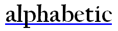
A typical “alphabetic” underline is positioned just below the alphabetic baseline

Note: The under value does not guarantee that the underline will not conflict with glyphs, as some fonts have descenders or diacritics that extend below the font’s descent metrics.
In vertical typographic modes, the underline is aligned as for under, except it is always aligned to the left edge of the text. If this causes the underline to be drawn on the «over» side of the text, then an overline also switches sides and is drawn on the «under» side. In vertical typographic modes, the underline is aligned as for under, except it is always aligned to the right edge of the text. If this causes the underline to be drawn on the «over» side of the text, then an overline also switches sides and is drawn on the «under» side.
In vertical typographic modes, the text-underline-position values left and right allow placing the underline on either side of the text. (In horizontal typographic modes , both values are treated as auto.)
The exact position and thickness of line decorations is UA-defined in this level. However, for underlines and overlines the UA must use a single thickness and position on each line for the decorations deriving from a single decorating box.
vs.
Correct and incorrect rendering of ABCD
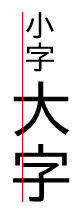
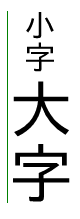
Due to the central baseline alignment of vertical text, a left-side underline on small vertical text will cut through the text of a child with a larger font size. The underline is not allowed to be broken, but adjusting its position further to the left properly accommodates all of the underlined text.
UAs must adjust line positions to match the shifted metrics of decorating boxes shifted with vertical-align values other than baseline [CSS2] or subscripted/superscripted via font-variant-position [CSS-FONTS-3], but must not adjust the line position or thickness in response to descendants of a decorating box that are so styled. This allows superscripts and subscripts to be properly decorated (underlined, struck through, etc.) but prevents them from distorting or breaking the positioning of such decorations on their ancestors.
Some font formats (such as OpenType) can offer information about the appropriate position of a line decoration. The UA should use such information (such as the underline thickness, or appropriate alphabetic underline position) from the font wherever appropriate.
Note: Typically, OpenType font metrics give the position of an alphabetic underline; in some cases (especially in CJK fonts), it gives the position of a under left underline. (In this case, the font’s underline metrics typically touch the bottom edge of the em box). The UA may but is not required to correct for incorrect font metrics.
3. Emphasis Marks
East Asian documents traditionally use small symbols next to each glyph to emphasize a run of text. For example:

Accent emphasis (shown in blue for clarity) applied to Japanese text
The text-emphasis shorthand, and its text-emphasis-style and text-emphasis-color longhands, can be used to apply such marks to the text. The text-emphasis-position property, which inherits separately, allows setting the emphasis marks’ position with respect to the text.
3.1. Emphasis Mark Style: the text-emphasis-style property
This property applies emphasis marks to the element’s text. Values have the following meanings:
No emphasis marks. The shape is filled with solid color. The shape is hollow. Display small circles as marks. The filled dot is U+2022 ‘•’, and the open dot is U+25E6 ‘◦’. Display large circles as marks. The filled circle is U+25CF ‘●’, and the open circle is U+25CB ‘○’. Display double circles as marks. The filled double-circle is U+25C9 ‘◉’, and the open double-circle is U+25CE ‘◎’. Display triangles as marks. The filled triangle is U+25B2 ‘▲’, and the open triangle is U+25B3 ‘△’. Display sesames as marks. The filled sesame is U+FE45 ‘﹅’, and the open sesame is U+FE46 ‘﹆’. Display the given string as marks. Authors should not specify more than one character in . The UA may truncate or ignore strings consisting of more than one grapheme cluster.
If a shape keyword is specified but neither of filled nor open is specified, filled is assumed. If only filled or open is specified, the shape keyword computes to circle in horizontal typographic modes and sesame in vertical typographic modes .
The marks should be drawn using the element’s font settings with the addition of the ruby feature and the size scaled down 50%. However, since not all fonts have all these glyphs, and some fonts use inappropriate sizes for emphasis marks in these code points, the UA may opt to use a font known to be good for emphasis marks, or the marks may instead be synthesized by the UA. Marks must remain upright in vertical typographic modes: like CJK characters, they do not rotate to match the writing mode. The orientation of marks in horizontal typographic modes of vertical writing modes is undefined in this level (but may be defined in a future level if definitive use cases arise).
Note: One example of good fonts for emphasis marks is Adobe’s open source Kenten Generic OpenType Font, which is specially designed for the emphasis marks.
The marks are drawn once for each typographic character unit. However, emphasis marks are not drawn for:
Note: Control over which characters are marked will be added in Level 4. (The list of punctuation may also be further refined, particularly for non-CJK punctuation.)
3.2. Emphasis Mark Color: the text-emphasis-color property
This property specifies the foreground color of the emphasis marks.
Note: currentcolor keyword computes to itself and is resolved to the value of color after inheritance is performed. This means text-emphasis-color by default matches the text color even as color changes across elements.
3.3. Emphasis Mark Shorthand: the text-emphasis property
This property is a shorthand for setting text-emphasis-style and text-emphasis-color in one declaration. Omitted values are set to their initial values.
Note that text-emphasis-position is not reset in this shorthand. This is because typically the shape and color vary, but the position is consistent for a particular language throughout the document. Therefore the position should inherit independently.
3.4. Emphasis Mark Position: the text-emphasis-position property
This property describes where emphasis marks are drawn at. If [ right | left ] is omitted, it defaults to right. The values have following meanings:
Draw marks over the text in horizontal typographic modes. Draw marks under the text in horizontal typographic modes. Draw marks to the right of the text in vertical typographic modes. Draw marks to the left of the text in vertical typographic modes.
Emphasis marks are drawn exactly as if each character was assigned the mark as its ruby annotation text with the ruby position given by text-emphasis-position and the ruby alignment as centered. Note that this position may be adjusted if it would conflict with underline or overline decorations.
The effect of emphasis marks on the line height is the same as for ruby text.
If emphasis marks are applied to characters for which ruby is drawn in the same position as the emphasis mark, the emphasis marks are placed outside the ruby. This includes auto-hidden and empty ruby annotations.
Emphasis marks applied to 4 characters, with ruby also on 2 of them
Some other editors prefer to hide ruby when they conflict with emphasis marks. In HTML, this can be done with the following pattern:
4. Text Shadows: the text-shadow property
This property accepts a comma-separated list of shadow effects to be applied to the text of the element. Values are interpreted as for box-shadow [CSS-BACKGROUNDS-3]. (But note that spread values and the inset keyword are not allowed.) Each layer shadows the element’s text and all its text decorations (composited together).
The shadow effects are applied front-to-back: the first shadow is on top. The shadows may thus overlay each other, but they never overlay the text itself. The shadow must be painted at a stack level between the element’s border and/or background (if present) and the elements text and text decoration. UAs should avoid painting text shadows over text in adjacent elements belonging to the same stack level and stacking context. (This may mean that the exact stack level of the shadows depends on whether the element has a border or background: the exact stacking behavior of text shadows is thus UA-defined.) It is undefined whether a given shadow layer shadows each glyph or decoration independently or if the text and/or decorations are flattened and then shadowed.
Unlike box-shadow, text shadows are not clipped to the shadowed shape and may show through if the text is partially-transparent. Like box-shadow , text shadows do not influence layout, and do not trigger scrolling or increase the size of the scrollable overflow area.
Note: The painting order of shadows defined here is the opposite of that defined in the 1998 CSS2 Recommendation.
The text-shadow property applies to both the ::first-line and ::first-letter pseudo-elements.
5. Painting Text Decorations
5.1. Painting Order of Text Decorations
As in [CSS2], text decorations are drawn immediately over/under the text they decorate, in the following order (bottommost first):
- shadows (text-shadow)
- underlines (text-decoration)
- overlines (text-decoration)
- text
- emphasis marks (text-emphasis)
- line-through (text-decoration)
Where line decorations are drawn across box decorations or atomic inlines, they are drawn over non-positioned content and just below any positioned descendants (immediately below layer #8 in CSS2.1 Appendix E).
5.2. Overflow of Text Decorations
Text decorations that leak outside a box are considered ink overflow: they do not extend the scrollable overflow area. [css-overflow-3]
Appendix A: Acknowledgements
This specification would not have been possible without the help from: Ayman Aldahleh, Bert Bos, Tantek Çelik, Stephen Deach, John Daggett, Martin Dürst, Laurie Anna Edlund, Ben Errez, Yaniv Feinberg, Arye Gittelman, Ian Hickson, Martin Heijdra, Richard Ishida, Masayasu Ishikawa, Michael Jochimsen, Eric LeVine, Ambrose Li, Håkon Wium Lie, Chris Lilley, Ken Lunde, Nat McCully, Shinyu Murakami, Paul Nelson, Chris Pratley, Marcin Sawicki, Arnold Schrijver, Rahul Sonnad, Michel Suignard, Takao Suzuki, Frank Tang, Chris Thrasher, Etan Wexler, Chris Wilson, Masafumi Yabe and Steve Zilles.
Appendix B: Default UA Stylesheet
This appendix is informative, and is to help UA developers to implement default stylesheet, but UA developers are free to ignore or change.
If you find any issues, recommendations to add, or corrections, please send the information to www-style@w3.org with [css-text-decor] in the subject line.
Appendix C: Changes
Changes since the August 2019 Candidate Recommendation
- Clarify that text-shadow animates as a shadow list like box-shadow. (Issue 4375)
- Be explicit about properties that apply to text. (Issue 5303)
- Minor editorial fixes.
Changes since the July 2018 Candidate Recommendation
- Clarified that text decoration overflow is ink overflow. (Issue 3272)
- Fixed inconsistencies in sample text-underline-position rules. (Issue 3441)
- Cleaned up “Computed value” lines to match new conventions.
Changes since the August 2013 Candidate Recommendation
Significant changes include:
- Deferred text-decoration-skip to Level 4 to allow for major changes. Defined behavioral defaults in prose. (Issue 1, Issue 22, Issue 26)
- Specified that line-throughs are unaffected by ink-skipping feature. (Issue 24)
- Recommended that when ink is skipped, line endings conform to the glyph shape. (Issue 30)
- Updated writing-mode–sensitive conditions to depend on typographic mode, to account for addition of sideways-lr and sideways-rl values to writing-mode property. Marked orientation of emphasis marks under sideways-lr and sideways-rl undefined. (Issue 10, Issue 20)
- Made [ right | left ] option of text-emphasis-position optional, defaulting to right. (Issue 17)
- Made text-underline-position imply auto instead of under when only left or right is specified. (Issue 18)
- Changed text decoration to skip leading and trailing spaces. (Issue 6)
- Noted that the positions of ruby annotations may be adjusted to avoid conflicts with text decorations. (Issue 21)
- Changed initial value of text-shadow to be currentColor . (Issue 28)
- Fixed error in “Computed value” line for text-shadow. (Issue 7)
- Fixed canonical order of text-shadow values to match implementations. (Issue 35)
- Defined positioning of emphasis marks with respect to auto-hidden and empty ruby annotations. (Issue 9)
Conformance
Document conventions
Conformance requirements are expressed with a combination of descriptive assertions and RFC 2119 terminology. The key words “MUST”, “MUST NOT”, “REQUIRED”, “SHALL”, “SHALL NOT”, “SHOULD”, “SHOULD NOT”, “RECOMMENDED”, “MAY”, and “OPTIONAL” in the normative parts of this document are to be interpreted as described in RFC 2119. However, for readability, these words do not appear in all uppercase letters in this specification.
All of the text of this specification is normative except sections explicitly marked as non-normative, examples, and notes. [RFC2119] Examples in this specification are introduced with the words “for example” or are set apart from the normative text with , like this: This is an example of an informative example. Informative notes begin with the word “Note” and are set apart from the normative text with , like this: Note, this is an informative note. Advisements are normative sections styled to evoke special attention and are set apart from other normative text with , like this: UAs MUST provide an accessible alternative.
Conformance classes
Conformance to this specification is defined for three conformance classes: style sheet A CSS style sheet. renderer A UA that interprets the semantics of a style sheet and renders documents that use them. authoring tool A UA that writes a style sheet. A style sheet is conformant to this specification if all of its statements that use syntax defined in this module are valid according to the generic CSS grammar and the individual grammars of each feature defined in this module. A renderer is conformant to this specification if, in addition to interpreting the style sheet as defined by the appropriate specifications, it supports all the features defined by this specification by parsing them correctly and rendering the document accordingly. However, the inability of a UA to correctly render a document due to limitations of the device does not make the UA non-conformant. (For example, a UA is not required to render color on a monochrome monitor.) An authoring tool is conformant to this specification if it writes style sheets that are syntactically correct according to the generic CSS grammar and the individual grammars of each feature in this module, and meet all other conformance requirements of style sheets as described in this module.
Partial implementations
So that authors can exploit the forward-compatible parsing rules to assign fallback values, CSS renderers must treat as invalid (and ignore as appropriate) any at-rules, properties, property values, keywords, and other syntactic constructs for which they have no usable level of support. In particular, user agents must not selectively ignore unsupported component values and honor supported values in a single multi-value property declaration: if any value is considered invalid (as unsupported values must be), CSS requires that the entire declaration be ignored.
Implementations of Unstable and Proprietary Features
To avoid clashes with future stable CSS features, the CSSWG recommends following best practices for the implementation of unstable features and proprietary extensions to CSS.
Non-experimental implementations
Once a specification reaches the Candidate Recommendation stage, non-experimental implementations are possible, and implementors should release an unprefixed implementation of any CR-level feature they can demonstrate to be correctly implemented according to spec. To establish and maintain the interoperability of CSS across implementations, the CSS Working Group requests that non-experimental CSS renderers submit an implementation report (and, if necessary, the testcases used for that implementation report) to the W3C before releasing an unprefixed implementation of any CSS features. Testcases submitted to W3C are subject to review and correction by the CSS Working Group. Further information on submitting testcases and implementation reports can be found from on the CSS Working Group’s website at https://www.w3.org/Style/CSS/Test/. Questions should be directed to the public-css-testsuite@w3.org mailing list.
CR exit criteria
- implements the specification.
- is available to the general public. The implementation may be a shipping product or other publicly available version (i.e., beta version, preview release, or «nightly build»). Non-shipping product releases must have implemented the feature(s) for a period of at least one month in order to demonstrate stability.
- is not experimental (i.e., a version specifically designed to pass the test suite and is not intended for normal usage going forward).
The specification will remain Candidate Recommendation for at least six months.
Подчеркнутый текст HTML
Подчеркнутый текст в HTML выделяется с помощью тега u HTML (от слова underline). Применяется он следующим образом (нужная часть текста помещается между тегами ):
Но данный код считается невалидным, поэтому значительно эффективнее и правильнее использовать CSS-стили для декорации текста.
Подчеркнуть текст — CSS
Как мы уже говорили в статье Зачеркнутый текст, декорации текста задаются при помощи свойства text-decoration. Подчеркнутый текст задается параметром underline:
Подчеркнуть текст с помощью CSS можно не только сплошной линией. Посмотрим, какими вариантами можно подчеркнуть текст:
Как видно из приведенных примеров, управлять стилем подчеркивания можно при помощи свойства border-bottom (нижняя граница). С помощью этого параметра можно задать тип подчеркивания, цвет, толщину.
text-decoration
The text-decoration shorthand CSS property sets the appearance of decorative lines on text. It is a shorthand for text-decoration-line , text-decoration-color , text-decoration-style , and the newer text-decoration-thickness property.
Try it
Text decorations are drawn across descendant text elements. This means that if an element specifies a text decoration, then a child element can’t remove the decoration. For example, in the markup
This text has some emphasized words in it.
, the style rule p would cause the entire paragraph to be underlined. The style rule em would not cause any change; the entire paragraph would still be underlined. However, the rule em would cause a second decoration to appear on «some emphasized words».
Constituent properties
This property is a shorthand for the following CSS properties:
Syntax
The text-decoration property is specified as one or more space-separated values representing the various longhand text-decoration properties.
Values
Sets the kind of decoration used, such as underline or line-through .
Sets the color of the decoration.
Sets the style of the line used for the decoration, such as solid , wavy , or dashed .
Похожие публикации:
- Как создаются в bootstrap формы и таблицы
- Cannot publish unborn head что делать
- Dns stub zone что это
- Foxit connected pdf что это
Как перечеркнуть текст в html
Рассмотрим все способы как можно сделать зачеркнутый текст через html и CSS. Существует два варианта реализации:
- Через html теги , и
- Через свойство CSS text-decoration
1. Зачеркнутый текст через html теги , и
Весь текст заключенные в html теги , и становится зачеркнутым. Необычная буква s произошло в сокращение от английского слова «strike».
Разница между всеми тремя тегами визуально отсутствуют. Однако последний вариант с использованием html тега считается более предпочтительным, поскольку он поддерживается в стандарте HTML5. Другие теги не поддерживаются (они конечно будут отображаться корректно, но валидацию не пройдут).
Преобразуется на странице в
Обычный шрифт. Зачеркнутый текст через тег s
Обычный текст. Зачеркнутый текст через тег strike
Обычный текст. Зачеркнутый текст через тег del
2. Зачеркнутый текст через свойство CSS text-decoration
В CSS есть свойство text-decoration, которое отвечает за подчеркивание текста.
Синтаксис CSS text-decoration
- none — текст без оформления
- underline — нижнее подчеркивание
- overline — верхнее подчеркивание
- line-through — зачеркивание текста
- blink — мерцающий текст (рекомендуется не применять это значение)
Нас интересует значение line-through , которое задает зачеркивание текста.
6.2. Акцентирование (выделение) текста в HTML
Акцентировать текст в большом количестве информации – хорошая идея. Ведь чтец может не заметить нужной, важной или еще какой-то информации, которую вы хотите донести. Например, я тоже акцентирую текст: теги, стили, атрибуты, ключевые слова, ссылки и прочее я выделяю своим цветом, но делаю я это при помощи стилей. В HTML предусмотрены стандартные «выделители» текста: жирное начертание, косое начертание, подчеркнутое начертание, зачеркнутое начертание, больше размера, меньше размера. Пробежимся по всем элементам акцентирования.
Жирный текст
Всеми известный жирный шрифт, который можно увидеть везде. Для этого было разработано два тега и . Тег , более распространенный. Эти теги не одинаковы, хоть и результат схож. Различие заключается в том, что тег определяет физическую жирность текста, а тег определяет важность этого текста и выделяет его жирным начертанием. Но, большое «но», в современных браузерах их права «уравняли», они стали равнозначными (эквивалентными). Такая же ситуация и у тегов и . Следовательно, выгоднее использовать тег, который короче. Далее пример:
Курсивный текст
За акцентирование курсивным шрифтом, отвечают теги и . Как сказано выше, они различны по своей направленности, но в современных браузерах эквивалентны. Далее пример:
Подчеркнутый текст
Акцентировать текст подчеркнутым шрифтом можно при помощи тега . Этот тег осуждают спецификацией HTML и рекомендуют использовать стили, с чем я и соглашусь. Я обязательно напишу эквиваленты тегов акцентирования в CSS. Далее пример:
Зачеркнутый текст
Для того чтобы зачеркнуть текст, используют два эквивалентных тега: и . Эти два тега осуждают и рекомендуют взамен им использовать стили. А тег категорически запрещен в HTML5. Далее пример:
Крупнее и мельче обычного текста
Акцентировать текст, можно и увеличив размер это текста. Для этого есть тег . Чтобы текст был мельче обычного, применяют тег . Но все же выгодно использовать всегда стили CSS. Далее пример:
Замена жирного текста стилями CSS
Есть такое свойство в CSS – font-weight . Оно принимает много значений: font-weight:bold|bolder|lighter|normal|100|200|300|400|500|600|700|800|900 . Чтобы сделать текст самым жирным, нужно использовать значение font-weight: 900 . О нем мы еще поговорим в следующих уроках.
Замена курсивного текста стилями CSS
В CSS есть аналог тегу (Курсивный текст). Это свойство font-style . Далее пример:
Замена подчеркнутого текста стилями CSS
Тег осуждается спецификацией HTML и рекомендуется использовать стили. Аналогом может служить свойство text-decoration . Я обычно его использую, чтобы убрать подчеркивание у ссылок (значение none), но в этом случае нам нужно добавить подчеркивание (значение underline). Далее пример:
Зачеркнутый текст HTML
Для зачеркивания текста в HTML применяется тег strike:
Результат выполнения данного кода:
- Электроник
- Сыроежкин
- Смирнов
- Чижиков
- Кукушкина
Данный тег не имеет атрибутов. Вместо тега HTML strike может использоваться и сокращенная его версия — s (аналогично, жирный — b, курсив — i, подчеркнутый — u):
Как вы можете видеть, результат аналогичен:
Конструктор LEGO «Нубекс»
Использование тега s и strike считается неверным с точки зрения валидации кода (необходимо использовать переходной Doctype). Или другой вариант — использовать CSS.
Перечеркнутый текст: CSS
С помощью CSS текст можно «декарировать» при помощи свойства text-decoration. Это свойство может принимать следующие значения:
- line-through — используется для перечеркивания текста;
- underline — подчеркивает текст;
- overline — используется для помещения линии над текстом (надчеркнутый текст);
- blink — тест мигает (каждую секунду);
- none — позволяет отменить все эффекты, примененные к тексту.
Указанные значения могут быть применены одновременно, для этого нужно записать нужные параметры через пробел. Например, применим одновременно подчеркивание, надчеркивание и мигание:
Зачеркиваем текст в html
Подробно о зачеркивании/перечеркивании текста в html:
Зачеркнутый текст html с помощью тега
У нас есть какой то текст, который надо зачеркнуть.
Берем данный тег
Оборачиваем данный текст в тег:
Результат вывода зачеркнутого текста в html/
Как видим, наш текст прекрасно зачеркнулся!
Зачеркнутый текст с помощью второго тега
Проделаем абсолютно те же операции, что в выше идущем пункте:
Во второй раз нам потребуется текст, который нужно зачеркнуть.
Берем второй тег
Опять оборачиваем наш текст тегом:
Результат вывода зачеркнутого текста в html/
Как видим, наш текст прекрасно зачеркнулся, и никакой разницы между первым зачеркнутым вторым зачеркнутым текстом нет!
Зачеркнутый текст с помощью третьего тега
Повторяем пройденное выше:
Для зачеркивания текста нам нужен текст:
Берем третий тег
Опять оборачиваем наш текст тегом:
Результат вывода зачеркнутого текста в html
Результат предсказуемый! Текст сделался перечеркнутым!
Свойство css для зачеркивания текста
В этот раз, не будем использовать теги:
Нам понадобится свойство r d .
И не забываем про «3 способа css», для примера используем данное свойство и значение прямо в теге:
И да мы забыли про текст:
Соберем весь код вместе:
Что следовало и ожидать — текст прекрасно зачеркнут!
Разница между зачеркнуть и перечеркнуть текст html.
На самом деле — эти два слова, зачеркнуть и перечеркнуть имеют один и тот же смысл.
Какая разница между зачеркнуть и перечеркнуть html!?
Для нас главная разница, по какому из запросов приходят больше или меньше!
Начнем с меньшего!
html перечеркнутый 281
перечеркнутый текст html 243
html тег перечеркнутый текст 22
+как сделать текст перечеркнутым html 11
html код перечеркнутый текст 7
Итого : получается, что количество запросов в месяц, где встречается слово «перечеркнутый» — 564 запросов в месяц.
Теперь словосочетание зачеркнутый html
зачеркнутый html 656
зачеркнутый текст html 549
html тег зачеркнутый текст 39
зачеркнутый тег +в html 20
+как сделать зачеркнутый текст +в html 18
html зачеркнуть слово 17
зачеркнутый шрифт html 16
html код зачеркнутый текст 15
зачеркнутый текст html css 9
html зачеркнутая цена 7
Итого получается, что количество запросов в месяц, где встречается слово «зачеркнутый» — 1346 запросов в месяц.
Похожие публикации:
- Как задать расстояние между строками в html
- Как запустить css в html
- Как изменить бэкграунд в html
- Как изменить расширение файла в windows 10 с txt на html
Как в css подчеркнуть текст
Добавляет оформление текста в виде его подчеркивания, перечеркивания, линии над текстом и мигания. Одновременно можно применить более одного стиля, перечисляя значения через пробел.
Синтаксис
text-decoration: [ blink || line-through || overline || underline ] | none | inherit
Значения
HTML5 CSS2.1 IE Cr Op Sa Fx
Объектная модель
[window.]document.getElementById(» elementID «).style.textDecoration
[window.]document.getElementById(» elementID «).style.textDecorationBlink
[window.]document.getElementById(» elementID «).style.textDecorationLineThrough
[window.]document.getElementById(» elementID «).style.textDecorationNone
[window.]document.getElementById(» elementID «).style.textDecorationOverLine
[window.]document.getElementById( «elementID «).style.textDecorationUnderline
Браузеры
Internet Explorer до версии 7.0 включительно не поддерживает значение inherit . Линия полученная с помощью значения line-through в IE7 располагается выше, чем в других браузерах; в IE8 эта ошибка исправлена.
Подчеркнутый текст html (CSS)
Рассмотрим все способы как можно сделать подчеркнутый текст через html и CSS. Всего существует три варианта:
- Через html тег и
- Через свойство CSS text-decoration
- Через свойство CSS border-bottom
Подчеркнутый текст через html тег и
Весь текст заключенные в теги и становится подчеркнутым.
Название пришло от английского слова «underline». Html тег считается более новым.
Преобразуется на странице в
Обычный текст. Подчеркнутый текст через тег u
Подчеркнутый текст через свойство CSS text-decoration
В CSS есть свойство text-decoration , которое отвечает за форматирование текста html для создания подчеркивания.
Синтаксис CSS text-decoration
- none — текст без оформления
- underline — нижнее подчеркивание
- overline — верхнее подчеркивание
- line-through — зачеркивание текста
- blink — мерцающий текст (рекомендуется не применять это значение)
Нас интересует значение underline
Преобразуется на странице в
Можно также задавать стиль линии и цвет. Более подробно про эту возможность читайте в статье: CSS text-decoration
Подчеркнутый текст через свойство CSS border-bottom
Свойство CSS border-bottom создано для создании рамок (границ) объекта снизу. Естественно таким образом можно задавать и подчеркивание тексту.
Преобразуется на странице в
Текст со свойством border-bottom (красное подчеркивание)
Текст со свойством border-bottom (пунктирное подчеркивание)
Способы подчеркивания в CSS
Существует куча разных способов оформления подчеркивания. Возможно, вы вспомните статью Марсина Вичари “Crafting link underlines” на Medium. Разработчики Medium не пытаются сделать что-то безумное, они просто хотят создать красивую линию под текстом.
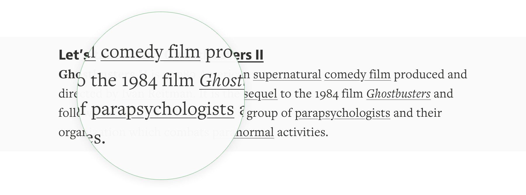
Это самое простое подчеркивание, но у него правильный размер и оно не перекрывает выносные элементы букв. И оно однозначно лучше дефолтного подчеркивания в большинстве браузеров. Medium пришлось столкнуться со сложностями для достижения своего стиля в вебе. Два года спустя, нам все также сложно сделать красивое подчеркивание.
Что не так с привычным text-decoration: underline ? Если речь идет об идеальном сценарии, подчеркивание должно делать следующее:
- позиционироваться ниже базовой линии;
- пропускать выносные элементы;
- изменять цвет, толщину и стиль линии;
- работать с многострочным текстом;
- работать на любом фоне.
Я считаю, что это все разумные требования, но насколько я знаю, не существует интуитивного способа добиться этого с помощью CSS.
Подходы
Так что это за различные способы, которыми мы можем реализовать подчеркивание в вебе?
Вот те, которые я рассматриваю:
- text-decoration ;
- border-bottom ;
- box-shadow ;
- background-image ;
- фильтры SVG;
- Underline.js (canvas);
- text-decoration-* .
Разберем эти способы один за другим и поговорим о плюсах и минусах каждого из них.
text-decoration
text-decoration это самый очевидный способ подчеркивания текста. Вы применяете одно свойство и этого достаточно. На небольших размерах шрифта это может выглядеть вполне прилично, но увеличьте размер шрифта и такое подчеркивание начинает выглядеть неуклюже.
Самая большая проблема с text-decoration это отсутствие настроек. Вы ограничены цветом и размером шрифта текста и у вас нет кроссбраузерного способа изменить это. Мы еще поговорим об этом подробнее.
- легко использовать;
- позиционируется ниже базовой линии;
- по умолчанию пропускает нижние выносные элементы в Safari и iOS;
- подчеркивает многострочный текст;
- работает на любом фоне.
- не пропускает нижние выносные элементы во всех остальных браузерах;
- не позволяет изменять цвет, толщину или стиль линии.
border-bottom
border-bottom предлагает хороший баланс между простотой и настраиваемостью. Этот подход использует старое доброе свойство CSS для границы, это значит, что вы можете легко изменять цвет, толщину и стиль.
Вот так border-bottom выглядит у строчных элементов.
Главный недостаток — это расстояние линии подчеркивания от текста, она целиком ниже выносных элементов. Вы можете исправить это, задав элементам свойство inline-block и уменьшив line-height , но тогда вы потеряете возможность оборачивать текст. Хорошо для отдельных строчек, но больше нигде непригодно.
Дополнительно, мы можете использовать text-shadow , чтобы перекрыть часть линии рядом с подстрочными элементами, имитируя это при помощи того же цвета, что и фон. То есть эта техника работает только на простом одноцветном фоне, без градиентов, паттернов или изображений.
На данный момент мы уже используем целых четыре свойства для оформления одной строчки. Это намного больше работы, чем просто добавить text-decoration .
- может пропускать выносные элементы с помощью text-shadow ;
- может изменять цвет, жирность и стиль линии;
- позволяет использовать переходы и анимации цвета и жирности;
- работает с многострочным текстом, если не применено значение inline-block ;
- работает на любом фоне, если не использовать text-shadow .
- позиционируется слишком низко и перемещается сложным способом;
- используется много дополнительных свойств для правильной работы;
- при использовании text-shadow выделение текста выглядит уродливо.
box-shadow
box-shadow рисует подстрочную линию за счет двух внутренних теней: одна создает прямоугольник, а вторая скрывает его часть. Это значит, что вам нужен однотонный фон для того, чтобы это работало.
Вы можете использовать тот же трюк с text-shadow для заполнения пропусков между подчеркиванием и выносными элементами. Но если цвет подчеркивания отличается от цвета текста — или он просто достаточно тонкий, линия не будет сталкиваться с выносными элементами так, как при использовании text-decoration .
- может позиционироваться ниже базовой линии;
- может пропускать выносные элементы за счет text-shadow ;
- позволяет изменять цвет и толщину линии;
- работает с многострочным текстом.
- не позволяет изменять стиль подчеркивания;
- работает не на любом фоне.
background-image
Метод с background-image наиболее близок к нашим желанием и обладает минимумом недостатков. Идея состоит в использовании linear-gradient и background-position для создания изображения, повторяющегося под строчками текста.
Для работы этого подхода необходимо, чтобы текст был в стандартном режиме display: inline; .
Следующий вариант обходится без linear-gradient , для эффектов вы можете добавить свое фоновое изображение.
- может позиционироваться ниже базовой линии;
- может пропускать выносные элементы за счет text-shadow ;
- допускает изменение цвета, толщины и стиля линии;
- работает с кастомными изображениями;
- обертывает несколько строчек текста;
- работает на любом фоне, если не применять text-shadow .
- размер изображения может изменяться в зависимости от разрешения экрана, браузера и увеличения.
Фильтры SVG
Я достаточно много поиграл с этим способом. Вы можете создать строчный фильтр SVG, который рисует линию и затем расширяет текст для маскировки части линии, которую мы хотим сделать прозрачной. Затем вы можете задать фильтру id и ссылаться на него в CSS примерно так filter: url(‘#svg-underline’) .
Преимущество этого подхода в том, что прозрачность достигается без применения text-shadow , то есть мы пропускаем выносные элементы на любом фоне, включая градиенты и фоновые изображения! Это работает только на отдельной строке текста, учитывайте это.
Вот как это выглядит в Chrome и Firefox:
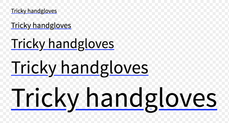
Поддержка в IE, Edge и Safari проблематична. Сложно тестировать поддержку фильтра SVG в CSS. Вы можете использовать директиву @supports с filter , но это проверит лишь работу ссылки на фильтр, но не работу самого фильтра. Мои попытки завершились муторным определением возможностей браузера, это ощутимый недостаток метода.
- может позиционироваться ниже базовой линии;
- может пропускать выносные элементы;
- допускает изменение цвета, толщины и стиля линии;
- работает на любом фоне.
- не работает с многострочным текстом;
- не работает в IE, Edge и Safari, но вы можете использовать text-decoration в качестве запасного варианта, в Safari он смотриться достойно.
Underline.js (Canvas)
Underline.js завораживает. Я считаю впечатляющим то, что сделала Вентин Жанг за счет владения JavaScript и внимания к деталям. Если вы не видели техническое демо Underline.js, бросайте читать и уделите ему минуту времени. Есть также ее девятиминутный доклад о том, как это работает, но я опишу кратко: подчеркивание рисуется с помощью элементов . Это новый подход, который работает на удивление хорошо.
Несмотря броское название, Underline.js это всего лишь техническое демо. Это значит, что вы не можете просто взять и подключить это в свой проект без изменения кода.
Я решил упомянуть об этом в доказательство концепции, что обладает потенциалом создания прекрасных интерактивных подчеркиваний, но чтобы это заработало, вам надо писать свой JavaScript.
Новые свойства text-decoration
Вы помните, что я обещал подробнее поговорить о text-decoration . Время пришло.
Само по себе это свойство отлично работает, но вы можете добавить несколько экспериментальных свойств для настройки внешнего вида подчеркивания.
- text-decoration-color
- text-decoration-skip
- text-decoration-style
Но слишком сильно не радуйтесь… Поддержка в браузерах — как всегда. Такие дела.
text-decoration-color
Свойство text-decoration-color позволяет вам изменять цвет подчеркивания отдельно от цвета текста. Поддержка этого свойства лучше, чем можно было ожидать — оно работает в Firefox и с префиксом в Safari. Вот в чем загвоздка: если у вас есть выносные элементы, Safari поместит подчеркивание поверх текста.
text-decoration-skip
Свойство text-decoration-skip включает пропуск выносных элементов в подчеркиваемом тексте.
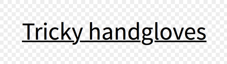
Это свойство нестандартное и работает сейчас только в Safari, с префиксом -webkit- . Safari по умолчанию активирует это свойство, поэтому выносные элементы всегда не перечеркиваются.
Если вы используете Normalize, то учтите, что последние версии отключают это свойство ради последовательного поведения браузеров. И если вы хотите, чтобы подчеркивание не затрагивало выносные элементы, вам надо вручную активировать его.
text-decoration-style
Свойство text-decoration-style предлагает такие же возможности оформления, что и у свойства border-style , добавляя кроме этого стиль wavy .
Вот список доступных значений:
Сейчас свойство text-decoration-style работает только в Firefox, вот скриншот из него:
Чего не хватает
Серия свойств text-decoration-* намного более интуитивна в использовании, чем остальные свойства CSS для оформления подчеркивания. Но если взглянуть внимательнее, то для удовлетворения наших запросов не хватает способов задать толщину или позицию линии.
После небольшого исследования, я нашел еще пару свойств:
- text-underline-width
- text-underline-position
Судя по всему, они относятся к ранним черновикам CSS, но их так и не реализовали в браузерах из-за отсутствия интереса.
Выводы
Так какой же способ подчеркивания лучший?
Для небольшого текста я рекомендую использовать text-decoration с оптимистичным добавлением text-decoration-skip . Это выглядит немного безвкусно в большинстве браузеров, но подчеркивание в браузерах было таким всегда и люди просто не обратят внимания. Плюс всегда есть шанс, что при наличии у вас терпения, это подчеркивание когда-нибудь будет выглядеть хорошо без необходимости для вас что-то менять, так как это сделают в браузерах.
Для основного текста имеет смысл использовать background-image . Этот подход работает, выглядит замечательно и для него есть миксины Sass. Вы, в принципе, можете пропустить text-shadow , если подчеркивание тонкое или отличается цветом от текста.
Для отдельных строк текста используйте border-bottom вместе с любыми дополнительными свойствами.
А если вам нужен пропуск выносных элементов на фоне градиента или изображения, попробуйте использовать фильтры SVG. Или просто избегайте использовать подчеркивание.
В будущем, когда поддержка в браузерах станет лучше, единственным ответом будет набор свойств text-decoration-* .
Также рекомендую обратить внимание на статью Бенджамина Вудроффа CSS Underlines Suck, в которой рассматриваются те же вопросы.
Подчеркнутый текст HTML
Подчеркнутый текст в HTML выделяется с помощью тега u HTML (от слова underline). Применяется он следующим образом (нужная часть текста помещается между тегами ):
Но данный код считается невалидным, поэтому значительно эффективнее и правильнее использовать CSS-стили для декорации текста.
Подчеркнуть текст — CSS
Как мы уже говорили в статье Зачеркнутый текст, декорации текста задаются при помощи свойства text-decoration. Подчеркнутый текст задается параметром underline:
Подчеркнуть текст с помощью CSS можно не только сплошной линией. Посмотрим, какими вариантами можно подчеркнуть текст:
Как видно из приведенных примеров, управлять стилем подчеркивания можно при помощи свойства border-bottom (нижняя граница). С помощью этого параметра можно задать тип подчеркивания, цвет, толщину.
Похожие публикации:
- Как задать расстояние между строками в css
- Как изменить расстояние между картинками в css
- Как уменьшить масштаб картинки в css
- Как установить css в sublime text 3
Как перечеркнуть текст в css
Тег отображает текст как перечеркнутый. Этот тег аналогичен тегу , но в отличие от него имеет сокращенную форму записи подобно тегам , и . Взамен этого тега рекомендуется использовать стили.
Синтаксис
ТекстЗакрывающий тег
Атрибуты
Аналог CSS
Валидация
Использование этого тега осуждается спецификацией HTML4, валидный код получается только при использовании переходного .
HTML5 IE Cr Op Sa Fx
Тег S Список должников
Чебурашка
Крокодил Гена
Шапокляк
Результат примера показан на рис. 1.
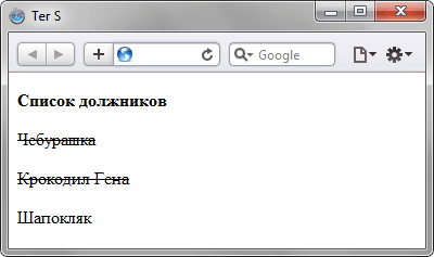
Рис. 1. Вид текста, оформленного с помощью тега
Не выкладывайте свой код напрямую в комментариях, он отображается некорректно. Воспользуйтесь сервисом cssdeck.com или jsfiddle.net, сохраните код и в комментариях дайте на него ссылку. Так и результат сразу увидят.
Типы тегов

HTML5

Блочные элементы

Строчные элементы

Универсальные элементы

Нестандартные теги

Осуждаемые теги

Видео

Документ

Звук

Изображения

Объекты

Скрипты

Списки

Ссылки

Таблицы

Текст

Форматирование

Формы

Фреймы