
Understanding How To Center An Image In CSS: Essential Techniques And Methods
Centering an image in CSS can be a tricky task, even for seasoned developers. This article breaks down various methods to achieve perfect image alignment, from traditional techniques to modern layout modules like Flexbox and Grid. Get ready to streamline your CSS image centering skills!

Understanding CSS Properties for Image Centering
When it comes to centering an image in CSS, understanding the relevant properties is crucial. These properties control the positioning and alignment of the image within its parent element.
Display Property
The display property in CSS determines how an element is displayed in the layout. For centering an image, we often use display: block; which makes the image behave like a block-level element.
Margin Property
The margin property is used to create space around an element. To center an image, we can use margin: auto; which automatically applies equal margins on both sides of the image.
Positioning Properties
CSS also offers positioning properties like position , top , right , bottom , and left . These can be used to position an image relative to its parent element or the viewport.
In the above code, position: absolute; positions the image relative to the nearest positioned ancestor. The top and left properties move the image’s top left corner to the center of the parent. The transform: translate(-50%, -50%); then shifts the image back by half of its own height and width, effectively centering it.
Flexbox and Grid
Modern CSS layouts often use Flexbox or Grid, which provide their own properties for centering content. We’ll explore these in later sections.
Centering an Image Horizontally
Centering an image horizontally in CSS can be achieved using different methods. The method you choose will depend on the specific layout and design requirements of your webpage.
Using Margin Auto
One of the simplest ways to center an image horizontally is by using the margin property with auto value. This method works when the image is set as a block-level element.
In the above code, display: block; makes the image behave like a block-level element. margin-left: auto; and margin-right: auto; apply equal margins on both sides of the image, centering it horizontally.
Using Text Align
Another method to center an image horizontally is by using the text-align property on the parent element. This method works when the image is an inline-level element.
In this example, the text-align: center; property is applied to a div that is the parent of the image. This centers the image within the div .
Using Flexbox
For a more modern approach, you can use the Flexbox layout module. Flexbox provides an easy and efficient way to align elements within a container.
In the above code, display: flex; makes the div a flex container. justify-content: center; then centers the image horizontally within the div .
Centering an Image Vertically
Centering an image vertically in CSS can be a bit more challenging than horizontal centering. However, with the right properties, it can be achieved effectively.
Using Padding
One method to center an image vertically within a container is by using equal padding at the top and bottom.
In the above code, the padding-top and padding-bottom properties are set to the same value, centering the image vertically within the div .
Using Line Height
Another method is to use the line-height property. This method works well when the height of the container is known.
In this example, the line-height property is set to the same value as the height of the div , centering the image vertically.
Using Flexbox
For a more modern and flexible approach, you can use the Flexbox layout module. Flexbox provides an easy way to align elements vertically within a container.
In the above code, display: flex; makes the div a flex container. align-items: center; then centers the image vertically within the div .
Each of these methods has its own use cases and advantages. Choose the one that best fits your layout and design needs.
Centering an Image Both Horizontally and Vertically.
Centering an image both horizontally and vertically can be achieved using a combination of CSS properties. This is often required when you want to place an image right in the center of a container or the viewport.
Using Position and Transform
One of the most common methods to center an image both horizontally and vertically is by using the position and transform properties.
In the above code, position: absolute; positions the image relative to the nearest positioned ancestor. The top and left properties move the image’s top left corner to the center of the parent. The transform: translate(-50%, -50%); then shifts the image back by half of its own height and width, effectively centering it.
Using Flexbox
For a more modern approach, you can use the Flexbox layout module. Flexbox provides an easy and efficient way to align elements both horizontally and vertically within a container.
In the above code, display: flex; makes the div a flex container. justify-content: center; centers the image horizontally, and align-items: center; centers it vertically.
How to Center an Image in CSS Grid
The CSS Grid layout module provides a powerful and efficient way to create complex layouts. It also offers a straightforward method to center an image both horizontally and vertically.
Setting Up the Grid
First, you need to set up the grid on the parent element. This is done using the display: grid; property.
In the above code, display: grid; makes the div a grid container.
Centering the Image
To center the image within the grid, you can use the place-items property. This property is a shorthand for align-items and justify-items , which control the vertical and horizontal alignment of grid items.
In the above code, place-items: center; centers the image both horizontally and vertically within the div .
Using Grid for Complex Layouts
The beauty of CSS Grid is that it allows for more complex layouts while still providing easy centering. You can define grid columns and rows, and place items in specific grid cells, all while keeping your image centered.
Center An Image Within A Responsive Container
If you’d like to center your image in a responsive container, so it looks centralized on any device, then you need to set a few more properties.
You can use media queries to adjust the container’s width and height based on different screen sizes.
Here’s how the code would appear:
.container < display: flex; align-items: center; justify-content: center; width: 100%; height: 300px; >@media (min-width: 720px) < .container < width: 720px; height: 480px; >>
The media query settings allow you to create different layouts for different screen sizes by adjusting the width and height of the container to 720px and 480px, respectively, when the viewport width is 720 pixels or greater.
Common Issues and Solutions
While centering an image in CSS is a common task, it can sometimes lead to unexpected issues. Here are some common problems and their solutions.
Image Not Centering
One common issue is that the image simply doesn’t center. This could be due to the image being an inline element by default. To fix this, you can set the image to be a block-level element using display: block; .
Image Going Offscreen
Another issue could be the image going offscreen when trying to center it using the position and transform properties. This could be due to the image’s size being larger than the parent element. To fix this, you can set a maximum width and height on the image.
Image Not Centering in Grid
If you’re using CSS Grid and the image isn’t centering, it could be due to the grid container not having a defined size. To fix this, you can set a specific height and width on the grid container.
In the above code, height: 100vh; and width: 100vw; set the height and width of the div to be the full viewport height and width, ensuring the image has space to center.
Remember, CSS is a powerful tool, but it requires careful handling. Always check your code for errors and test your layouts in different browsers to ensure compatibility.
Frequently Asked Questions
Can I center an image without flexbox?
Use this code to center an image without flex.
Как выровнять текст по ширине?
Выравниванием по ширине называется такой способ форматирования текста, когда левый и правый края текста выравниваются по вертикальным линиям (рис. 1).
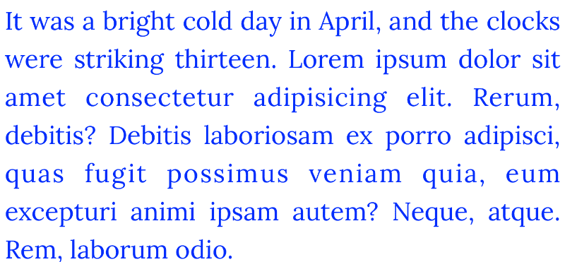
Рис. 1. Выравнивание текста по ширине
Для выравнивания правого края текста браузер добавляет пустые промежутки между слов, что иногда смотрится неаккуратно.
Чтобы выровнять текст по ширине ему достаточно добавить свойство text-align со значением justify , как показано в примере 1.
Пример 1. Использование text-align
В данном примере мы используем класс text-justify , который при добавлении его к любому элементу выравнивает текст по ширине.
Последняя строка нашего текста по умолчанию остаётся выровненной по левому краю. Для управления поведением последней строки есть отдельное свойство text-align-last. К примеру, значение right выравнивает по правому краю, а center — по центру (пример 2).
Пример 2. Использование text-align-last
См. также
- text-align
- text-align-last
- Свойства текста в CSS
Способы выровнять картинки по центру HTML

Но также давно существуют различные варианты, которые задействованы на выравнивание картинок по центру, только уже при помощи CSS. Для начало нм понадобиться div обертка, но и безусловно сам материал в виде картинки. И здесь первым делом мы создаем div класс, под названием center-picture, где в последствие в него пропишем изображение.
Когда дело доходит до центрирования чего-либо как по горизонтали, так и по вертикали, то сложность работа может быть немного повышенной для достижения. В этой статье мы рассмотрим несколько методов, чтобы полностью центрировать элемент.

Далее остается выставить базовые стили для заданного класса center-picture, где задаем высоту и ширину,которая идет немного больше чем по умолчанию картинка, а также поставим обвод или рамку, где 1px пикселя в вполне хватит.
.karkas-bloka <
width: 250px;
height: 250px;
border: 1px solid #827f7f;
>
Где после установки мы буден наблюдать такой результат:

1. Вариант: Добавляем к изображению класс .center-picture.
Этот вариант заключается в том чтобы к изображению прописать свойство display, где идет значение block, что не обойтись без margin:auto. Вероятно такой вариант многим знаком по своей структуре, где возможно уже задействовали его для центрирования div. Главное нельзя забывать про то, что любое изображение идет как строчный элемент, где нам необходимо прописать к основе display:block.

.center-picture <
display:block;
margin: auto;
>
Теперь смотрим, как получится, после того, как поставите и все сохраните на сайте.

2. Вариант: с классом image-align
Здесь нужно скопировать предоставленный html код, что присутствует в этом методе. Где к DIV karkas-bloka добавляем еще один класс image-align. А вот оставшийся класс .image-center нужно убрать, он там лишний.
Этот способ заключается в том, для того, чтобы все содержимое, что находится в DIV отцентрировать при помощи text-align : center. Здесь нужно добавить, если прописываем текст в DIV, то он аналогично с изображением центрироваться.

.image-align <
text-align: center;
>
Но и сам результат после как все поставим.

3. Вариант: на свойстве display:flex
Этот способ будем основывать на свойстве display:flex — где нужно взять код html, что ранее был задействован на втором варианте, и там нужно изменить класс image-align на image-flex.

.image-flex <
display:flex;
align-items: center;
justify-content: center;
>
Если кто еще не знает, то свойство align-items изначально центрирует картинки по вертикали, а вот justify-content уже задействовано по горизонтали. Этот вариант в отличие от других двух имеет свою небольшой плюс, который заключается в том, что можно выравнивать изображение по двум осям.

Центрирование div на странице по горизонтали и вертикали
При построении макетов веб-страниц вы, вероятно, сталкивались с ситуацией, когда вам нужно центрировать div как по горизонтали, так и по вертикали с помощью чистого CSS.
.gorizontal-vertikal <
position: absolute;
margin: auto;
top: 0;
right: 0;
bottom: 0;
left: 0;
width: 135px;
height: 135px;
background-color: #989595;
border-radius: 5px;
>
Есть более чем несколько способов достичь этого, но этот считаю самым популярным.
Абсолютное центрирование в CSS

Если вы хотите центрировать что-то в CSS по горизонтали, вы можете сделать это просто с помощью text-align: center; при работе со встроенными элементами или margin: 0 auto; при работе с блочным элементом.
.absolute-centering <
background-color: #850cd0;
width: 325px;
min-height: 150px;
padding: 7px;
display: flex;
justify-content: center;
align-items: center;
position: absolute;
top: 50%;
left: 50%;
transform: translate(-50%, -50%);
>
На этом не заканчиваем, так как есть возможно другие варианты, но эти самые ходовые, что можно встретить. Где теперь у вас не возникнут вопрос по теме, как правильно выставить по центру, так как сами видите, что не чего сложного в этом нет, в плане как нужно отцентрировать картинки по центру div.
Видео обзор с пояснением на варианты:
Как выровнять картинку по центру?
Есть лого. Содержится внутри тега h1 , принадлежащего классу logo .
В CSS у #logo стоит text-align: left , я его перегружаю в #logo img , пишу text-align: center . Даже в теге img прописываю align=»middle» . Хоть бы хны, всё равно слева. Отладчики хрома и оперы показывают, что у изображения стоит свойство text-align: center . На всякий случай, так выглядит рассчитанный стиль:
background-attachment: scroll; background-clip: border-box; background-color: #EEE; background-image: url(header_outer.jpg); background-origin: padding-box; color: #333; display: block; font-family: arial, helvetica, sans-serif; font-size: 16px; height: 1133px; margin-bottom: 0px; margin-left: 0px; margin-right: 0px; margin-top: 0px; padding-bottom: 0px; padding-left: 0px; padding-right: 0px; padding-top: 0px; position: relative; text-align: center; width: 1263px; Отслеживать
8,657 18 18 золотых знаков 73 73 серебряных знака 181 181 бронзовый знак
задан 20 мая 2011 в 20:35
185 2 2 золотых знака 2 2 серебряных знака 11 11 бронзовых знаков
3 ответа 3
Сортировка: Сброс на вариант по умолчанию
text-align не работает для изображений, это свойство выравнивает только текст. Чтобы выровнять что-либо, этому объекту нужно задать свойство display:block; , потом задать ему ширину width: 1263px; и в конце присвоить ему свойство margin:0 auto; .
Отслеживать
8,657 18 18 золотых знаков 73 73 серебряных знака 181 181 бронзовый знак
ответ дан 21 мая 2011 в 8:56
141 6 6 бронзовых знаков
вам прийдется убрать: margin-bottom: 0px; margin-left: 0px; margin-right: 0px; margin-top: 0px; position: relative; иначе то что я написал выше работать не будет