
Realizing common layouts using CSS Grid Layout
Чтобы завершить набор руководств по CSS Grid Layout, я собираюсь пройтись по основным видам макетов, которые демонстрируют несколько различных методов, которые можно использовать при проектировании с помощью grid layout. Мы рассмотрим пример использования областей сетки-шаблона, типичную гибкую сеточную систему с 12 столбцами, а также список продуктов с использованием автоматического размещения. Как вы можете видеть из этого списка примеров, существует несколько способов достижения желаемого результата с помощью компоновки сетки. Выберите метод, который вы считаете наиболее полезным для решения проблем, которые вы решаете, и проектов, которые вам нужно реализовать.
Адаптивный 1-3 колоночный макет с использованием grid-template-areas
Многие веб-сайты являются разновидностью такого типа макета, с основным содержанием, боковыми панелями, хедером и футером. В адаптивном дизайне вы можете отобразить макет в виде одного столбца, добавив боковую панель в определённом месте, а затем ввести макет из трёх столбцов для более широких экранов.
Я собираюсь создать этот макет, используя именованные области шаблонов, о которых мы узнали в руководстве Grid template areas.
Моя разметка-это контейнер с элементами внутри для хедера и футера, основного контента, навигации, боковой панели и блока, в который я собираюсь поместить рекламу.
* box-sizing: border-box; > .wrapper max-width: 1024px; margin: 0 auto; font: 1.2em Helvetica, arial, sans-serif; > .wrapper > * border: 2px solid #f08c00; background-color: #ffec99; border-radius: 5px; padding: 10px; > nav ul list-style: none; margin: 0; padding: 0; >
div class="wrapper"> header class="main-head">The headerheader> nav class="main-nav"> ul> li>a href="">Nav 1a>li> li>a href="">Nav 2a>li> li>a href="">Nav 3a>li> ul> nav> article class="content"> h1>Main article areah1> p> In this layout, we display the areas in source order for any screen less that 500 pixels wide. We go to a two column layout, and then to a three column layout by redefining the grid, and the placement of items on the grid. p> article> aside class="side">Sidebaraside> div class="ad">Advertisingdiv> footer class="main-footer">The footerfooter> div>
Поскольку мы используем grid-template-areas для создания макета, вне каких-либо медиавыражений, мне нужно назвать области. Мы называем области, используя свойство grid-area .
.main-head grid-area: header; > .content grid-area: content; > .main-nav grid-area: nav; > .side grid-area: sidebar; > .ad grid-area: ad; > .main-footer grid-area: footer; >
Это не создаст никакого макета, однако наши элементы теперь имеют имена, которые мы можем использовать для создания. Оставаясь вне каких-либо медиавыражений, я теперь собираюсь настроить макет для мобильной платформы. Здесь я держу все в исходном порядке, пытаясь избежать любого разрыва между источником и дисплеем, как описано в руководстве Grid layout and accessibility (en-US) . У меня нет столбцов или строк, т. к. такой макет предполагает один столбец, и строки будут создаваться по мере необходимости для каждого из элементов неявной сетки.
.wrapper display: grid; grid-gap: 20px; grid-template-areas: "header" "nav" "content" "sidebar" "ad" "footer"; >
После настройки мобильного макета мы получим единственный столбец при всех размерах экрана, теперь мы можем добавить медиавыражение и переопределить наш макет для того обстоятельства, что у нас достаточно экранного места, чтобы разместить два столбца.
@media (min-width: 500px) .wrapper grid-template-columns: 1fr 3fr; grid-template-areas: "header header" "nav nav" "sidebar content" "ad footer"; > nav ul display: flex; justify-content: space-between; > >
Вы можете видеть, как макет принимает форму в значении grid-template-areas . Заголовок охватывает две дорожки столбцов, как и навигационная система. В треке третьего ряда у нас есть боковая панель рядом с содержимым. В четвёртой строке я решил разместить свой рекламный контент – так он появляется под боковой панелью, а затем футер, рядом с ним под контентом. Я использую flexbox в навигации, чтобы отобразить его в разнесённом ряду.
Теперь я могу добавить конечные точки в наш 3-х колоночный макет.
@media (min-width: 700px) .wrapper grid-template-columns: 1fr 4fr 1fr; grid-template-areas: "header header header" "nav content sidebar" "nav content ad" "footer footer footer"; > nav ul flex-direction: column; > >
Трёхколоночный макет имеет две боковые колонки размером 1fr и среднюю колонку, размером 4fr . Это означает, что доступное пространство в контейнере разделено на 6 ячеек и распределено пропорционально нашему макету – по одной части к боковым колонкам и по 4 части к центру.
В этом макете я показываю навигацию в левой колонке, рядом с содержимым. В правой колонке у нас есть боковая панель, а под ней блок рекламы (ad). Футер теперь охватывает всю нижнюю часть макета. Затем я использую flexbox для отображения навигации в виде столбца.
Это простой пример, но он демонстрирует, как мы можем использовать grid layout для перестройки нашего макета. В частности, я изменяю расположение рекламного блока, как заложено в настройках столбцов. Этот метод очень полезен на этапе прототипирования, он легко позволяет экспериментировать с расположением элементов. Вы всегда можете использовать сетку таким образом для прототипирования, даже несмотря на особенности отражения в различных браузерах, которые показывают ваш сайт.
Гибкий 12-колоночный макет
Если вы работали с фреймворками или grid системами, вам знакомо размещение сайта на гибкой сетке с 12 или 16 столбцами. Мы можем создать такой макет, используя CSS Grid Layout. В качестве простого примера я создаю гибкую сетку из 12 столбцов, которая имеет 12 линий столбцов размером 12 1fr -все они имеют начальную линию с именем col-start . Это означает, что у нас будет двенадцать линий сетки с именем col-start .
.wrapper max-width: 1024px; margin: 0 auto; font: 1.2em Helvetica, arial, sans-serif; > .wrapper > * border: 2px solid #f08c00; background-color: #ffec99; border-radius: 5px; padding: 10px; >
.wrapper display: grid; grid-template-columns: repeat(12, [col-start] 1fr); grid-gap: 20px; >
Чтобы продемонстрировать, как работает эта сеточная система, у меня внутри оболочки есть четыре дочерних элемента.
div class="wrapper"> div class="item1">Start column line 1, span 3 column tracks.div> div class="item2"> Start column line 6, span 4 column tracks. 2 row tracks. div> div class="item3">Start row 2 column line 2, span 2 column tracks.div> div class="item4"> Start at column line 3, span to the end of the grid (-1). div> div>
Затем я могу поместить их в сетку, используя именованные линии, а также ключевое слово span.
.item1 grid-column: col-start / span 3; > .item2 grid-column: col-start 6 / span 4; grid-row: 1 / 3; > .item3 grid-column: col-start 2 / span 2; grid-row: 2; > .item4 grid-column: col-start 3 / -1; grid-row: 3; >
Как описано в руководстве по именованным строкам, мы используем именованную строку для размещения нашего элемента. Поскольку у нас есть 12 строк с одинаковым именем, мы используем имя, а затем индекс строки. Вы также можете использовать только индекс строки, если избегаете использования именованных строк.
Вместо того чтобы устанавливать номер конечной строки, я решил указать, сколько треков должен охватить этот элемент, используя ключевое слово span. Мне нравится этот подход, поскольку при работе с системой макета с несколькими столбцами мы обычно думаем о блоках с точки зрения количества треков сетки, которые они охватывают, и в зависимости от этого корректируем. Чтобы увидеть, как блоки выравниваются по трекам, используйте инспектор сетки Firefox Grid Inspector (en-US) . Он наглядно демонстрирует, как расположены наши предметы.

Существуют некоторые ключевые различия в том, как макет сетки работает над сеточными системами, которые вы, возможно, использовали ранее. Как вы можете видеть, нам не нужно добавлять какую-либо разметку для создания строки, сеточные системы должны сделать это, чтобы остановить элементы, появляющиеся в строке выше. С помощью CSS Grid Layout мы можем размещать элементы в строки, не опасаясь, что они поднимутся в строку выше, если она останется пустой. Благодаря этому строгому размещению столбцов и строк мы также можем легко оставить пустое пространство в нашем макете. Нам также не нужны специальные классы, чтобы тянуть или толкать элементы, чтобы вдавливать их в сетку. Все, что нам нужно сделать, это указать начальную и конечную строку для элемента.
Построение макета с использованием 12-столбцовой системы
Чтобы увидеть, как этот метод макета работает на практике, мы можем создать тот же самый макет, который мы создали с grid-template-areas , на этот раз используя сеточную систему из 12 столбцов. Я начинаю с той же разметки, которая используется для примера областей шаблона сетки.
* box-sizing: border-box; > .wrapper max-width: 1024px; margin: 0 auto; font: 1.2em Helvetica, arial, sans-serif; > .wrapper > * border: 2px solid #f08c00; background-color: #ffec99; border-radius: 5px; padding: 10px; > nav ul list-style: none; margin: 0; padding: 0; >
div class="wrapper"> header class="main-head">The headerheader> nav class="main-nav"> ul> li>a href="">Nav 1a>li> li>a href="">Nav 2a>li> li>a href="">Nav 3a>li> ul> nav> article class="content"> h1>Main article areah1> p> In this layout, we display the areas in source order for any screen less that 500 pixels wide. We go to a two column layout, and then to a three column layout by redefining the grid, and the placement of items on the grid. p> article> aside class="side">Sidebaraside> div class="ad">Advertisingdiv> footer class="main-footer">The footerfooter> div>
Затем я настраиваю сетку как в примере выше.
.wrapper display: grid; grid-template-columns: repeat(12, [col-start] 1fr); grid-gap: 20px; >
Мы снова собираемся сделать этот макет адаптивным, но на этот раз с использованием именованных линий. Каждая контрольная точка будет использовать сетку из 12 столбцов, однако количество дорожек, которые будут охватывать элементы, будет меняется в зависимости от размера экрана.
Прежде всего мы запускаем мобильные устройства, и все, что нам нужно для самых узких экранов, — это чтобы элементы оставались в исходном порядке и были расположены прямо по сетке.
.wrapper > * grid-column: col-start / span 12; >
В следующей контрольной точке мы хотим перейти к двухколоночному макету. Наш заголовок и навигация по-прежнему охватывают всю сетку, поэтому нам не нужно указывать для них какое-либо позиционирование. Боковая панель начинается с первой строки столбца с именем col-start, охватывающей 3 строки. Он идёт после строки 3, так как заголовок и навигация находятся в первых двух дорожках строки.
Панель объявлений находится ниже боковой панели, поэтому начинается с строки сетки 4. Затем у нас есть основное содержимое и футер, начинающийся с col-start 4 и охватывающий 9 треков, ведущих их к концу сетки.
@media (min-width: 500px) .side grid-column: col-start / span 3; grid-row: 3; > .ad grid-column: col-start / span 3; grid-row: 4; > .content, .main-footer grid-column: col-start 4 / span 9; > nav ul display: flex; justify-content: space-between; > >
Наконец, мы переходим к трёхколоночной версии этого макета. Заголовок продолжает распространяться прямо по сетке, но теперь навигация перемещается вниз, чтобы стать первой боковой панелью с основным содержимым, а затем боковой панелью рядом с ней. Футер теперь также охватывает весь макет.
@media (min-width: 700px) .main-nav grid-column: col-start / span 2; grid-row: 2 / 4; > .content grid-column: col-start 3 / span 8; grid-row: 2 / 4; > .side grid-column: col-start 11 / span 2; grid-row: 2; > .ad grid-column: col-start 11 / span 2; grid-row: 3; > .main-footer grid-column: col-start / span 12; > nav ul flex-direction: column; > >
Снова смотрим Grid Inspector (en-US) , чтобы увидеть, какую форму принял наш макет.

При создании этого макета следует отметить, что нам не нужно было явно размещать каждый элемент сетки в каждой контрольной точке. Мы унаследовали ранее настроенное размещение – преимущество работы «сначала мобильный». Мы также можем воспользоваться преимуществами автоматического размещения сетки. Сохраняя элементы в логическом порядке, автоматическое размещение делает довольно много работы за нас при размещении элементов в сетке. В последнем примере этого руководства мы создадим макет, который полностью зависит от автоматического размещения.
Создание списка с помощью авторазмещения
Многие макеты, по сути, представляют собой наборы «карточек» — списки продуктов, галереи изображений и так далее. Сетка может очень легко создавать эти списки таким образом, чтобы они были отзывчивыми, без необходимости добавления медиавыражений. В следующем примере я комбинирую CSS Grid и Flexbox макеты, чтобы сделать простой макет списка продуктов.
Разметка моего списка-это неупорядоченный список элементов. Каждый элемент содержит заголовок, некоторый текст различной высоты и ссылку с призывом к действию.
ul class="listing"> li> h2>Item Oneh2> div class="body">p>The content of this listing item goes here.p>div> div class="cta">a href="">Call to action!a>div> li> li> h2>Item Twoh2> div class="body">p>The content of this listing item goes here.p>div> div class="cta">a href="">Call to action!a>div> li> li class="wide"> h2>Item Threeh2> div class="body"> p>The content of this listing item goes here.p> p>This one has more text than the other items.p> p>Quite a lot morep> p>Perhaps we could do something different with it?p> div> div class="cta">a href="">Call to action!a>div> li> li> h2>Item Fourh2> div class="body">p>The content of this listing item goes here.p>div> div class="cta">a href="">Call to action!a>div> li> li> h2>Item Fiveh2> div class="body">p>The content of this listing item goes here.p>div> div class="cta">a href="">Call to action!a>div> li> ul>
* box-sizing: border-box; > img max-width: 100%; display: block; > body font: 1.2em Helvetica, arial, sans-serif; > a:link, a:visited text-decoration: none; color: #f08c00; > h2 background-color: #f08c00; color: #fff; text-align: center; margin: 0; padding: 20px; >
Мы собираемся создать сетку с гибким количеством гибких столбцов. Я хочу, чтобы они никогда не становились меньше 200 пикселей, а затем делили любое доступное оставшееся пространство поровну – так мы всегда получаем одинаковые по ширине дорожки столбцов. Мы достигаем этого с помощью функции minmax() в нашей повторной нотации для определения размера трека.
.listing list-style: none; margin: 2em; display: grid; grid-gap: 20px; grid-template-columns: repeat(auto-fill, minmax(200px, 1fr)); >
Как только я добавляю этот CSS, элементы начинают раскладываться в виде сетки. Если я сделаю окно меньше или шире, количество дорожек столбцов изменится – без необходимости переопределять сетку.
Затем я могу привести в порядок внутренние части ячеек, используя flexbox. Я установил для элемента списка display: flex and и flex-direction для column . Затем я могу использовать margin auto для .cta чтобы подтолкнуть этот элемент вниз к нижней части ячейки.
.listing li border: 1px solid #ffe066; border-radius: 5px; display: flex; flex-direction: column; > .listing .cta margin-top: auto; border-top: 1px solid #ffe066; padding: 10px; text-align: center; > .listing .body padding: 10px; >
Это действительно одна из ключевых причин, по которой я буду использовать flexbox, а не сетку, если я просто выравниваю или распределяю что-то в одном измерении, это вариант использования flexbox.
Теперь все это выглядит более завершённым. Однако иногда у нас есть эти элементы, которые содержат больше контента, чем другие. Было бы неплохо, чтобы они охватывали два трека, и тогда они не будут такими высокими. У меня есть класс wide для большого элемента, и я добавляю правило grid-column-end (en-US) со значением span 2 . Теперь, когда grid столкнётся с этим элементом, он назначит ему два трека. В некоторых точках это означает, что мы получим разрыв в сетке – там, где нет места для размещения двухтрекового элемента.

Я могу привести причину недостатка заполнения с помощью grid-auto-flow : dense в грид ячейке. Будьте осторожны, когда делаете это, поскольку это действительно уводит элементы от их логического исходного порядка. Вы должны делать это только в том случае, если ваши элементы не имеют установленного порядка – и быть в курсе проблем порядка вкладок после источника, а не вашего переупорядоченного отображения.
ul class="listing"> li> h2>Item Oneh2> div class="body">p>The content of this listing item goes here.p>div> div class="cta">a href="">Call to action!a>div> li> li> h2>Item Twoh2> div class="body">p>The content of this listing item goes here.p>div> div class="cta">a href="">Call to action!a>div> li> li class="wide"> h2>Item Threeh2> div class="body"> p>The content of this listing item goes here.p> p>This one has more text than the other items.p> p>Quite a lot morep> p>Perhaps we could do something different with it?p> div> div class="cta">a href="">Call to action!a>div> li> li> h2>Item Fourh2> div class="body">p>The content of this listing item goes here.p>div> div class="cta">a href="">Call to action!a>div> li> li> h2>Item Fiveh2> div class="body">p>The content of this listing item goes here.p>div> div class="cta">a href="">Call to action!a>div> li> ul>
* box-sizing: border-box; > img max-width: 100%; display: block; > body font: 1.2em Helvetica, arial, sans-serif; > a:link, a:visited text-decoration: none; color: #f08c00; > h2 background-color: #f08c00; color: #fff; text-align: center; margin: 0; padding: 20px; > .listing li border: 1px solid #ffe066; border-radius: 5px; display: flex; flex-direction: column; > .listing .cta margin-top: auto; border-top: 1px solid #ffe066; padding: 10px; text-align: center; > .listing .body padding: 10px; >
.listing list-style: none; margin: 2em; display: grid; grid-gap: 20px; grid-auto-flow: dense; grid-template-columns: repeat(auto-fill, minmax(200px, 1fr)); > .listing .wide grid-column-end: span 2; >
Этот метод использования автоматического размещения с некоторыми правилами, применяемыми к определённым элементам, очень полезен и может помочь вам с контентом, который выводится CMS, например, где у вас есть повторяющиеся элементы и, возможно, вы можете добавить класс к определённым элементам, когда они отображаются в HTML.
Дальнейшие исследования
Лучший способ научиться использовать сеточный макет-это продолжать строить примеры, подобные тем, которые мы рассмотрели здесь. Выберите что-то, что вы обычно строите, используя свой фреймворк выбора или используя поплавки, и посмотрите, сможете ли вы построить его с помощью сетки. Не забудьте найти примеры, которые невозможно построить с помощью современных методов. Это может означать, что вы черпаете вдохновение из журналов или других источников, не связанных с интернетом. Сеточный макет открывает возможности, которых у нас раньше не было, нам не нужно быть привязанными к тем же старым макетам, чтобы использовать его.
- For inspiration see the Layout Labs from Jen Simmons, she has been creating layouts based on a range of sources.
- For additional common layout patterns see Grid by Example, where there are many smaller examples of grid layout and also some larger UI patterns and full page layouts.
Found a content problem with this page?
- Edit the page on GitHub.
- Report the content issue.
- View the source on GitHub.
This page was last modified on 7 авг. 2023 г. by MDN contributors.
Grids
CSS grid layout is a two-dimensional layout system for the web. It lets you organize content into rows and columns and offers many features to simplify the creation of complex layouts. This article will explain all you need to know to get started with grid layout.
| Prerequisites: | HTML basics (study Introduction to HTML) and an idea of how CSS works (study Introduction to CSS and Styling boxes.) |
|---|---|
| Objective: | To understand the fundamental concepts of grid layout as well as how to implement it with CSS Grid. |
What is grid layout?
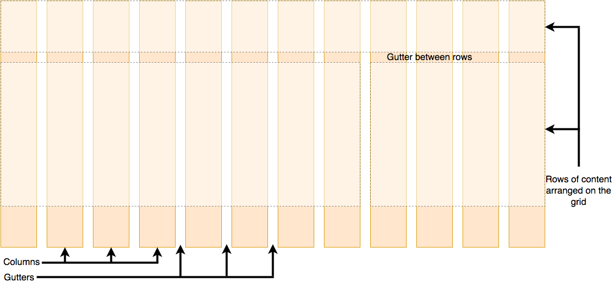
A grid is a collection of horizontal and vertical lines creating a pattern against which we can line up our design elements. They help us to create layouts in which our elements won’t jump around or change width as we move from page to page, providing greater consistency on our websites.
A grid will typically have columns, rows, and then gaps between each row and column. The gaps are commonly referred to as gutters.
Creating your grid in CSS
Having decided on the grid that your design needs, you can use CSS Grid Layout to create it. We’ll look at the basic features of Grid Layout first and then explore how to create a simple grid system for your project. The following video provides a nice visual explanation of using CSS Grid:
Defining a grid
Let’s try out grid layouts with the help of an example. Download and open the starting point file in your text editor and browser (you can also see it live here). You will see an example with a container, which has some child items. By default, these items are displayed in a normal flow, causing them to appear one below the other. For the initial part of this lesson, we’ll be using this file to see how its grid behaves.
Similar to how you define flexbox, you define a grid layout by setting the value of the display property to grid . As in the case of flexbox, the display: grid property transforms all the direct children of the container into grid items. Add the following CSS to your file:
.container display: grid; >
Unlike Flexbox, the items will not immediately look any different. Declaring display: grid gives you a one column grid, so your items will continue to display one below the other as they do in normal flow.
To see something that looks more grid-like, we’ll need to add some columns to the grid. Let’s add three 200-pixel columns. You can use any length unit or percentage to create these column tracks.
.container display: grid; grid-template-columns: 200px 200px 200px; >
Add the second declaration to your CSS rule, then reload the page. You should see that the items have rearranged themselves such that there’s one in each cell of the grid.
body width: 90%; max-width: 900px; margin: 2em auto; font: 0.9em/1.2 Arial, Helvetica, sans-serif; > .container > div border-radius: 5px; padding: 10px; background-color: rgb(207, 232, 220); border: 2px solid rgb(79, 185, 227); >
div class="container"> div>Onediv> div>Twodiv> div>Threediv> div>Fourdiv> div>Fivediv> div>Sixdiv> div>Sevendiv> div>
Flexible grids with the fr unit
In addition to creating grids using lengths and percentages, we can use fr . The fr unit represents one fraction of the available space in the grid container to flexibly size grid rows and columns.
Change your track listing to the following definition, creating three 1fr tracks:
.container display: grid; grid-template-columns: 1fr 1fr 1fr; >
You now have flexible tracks. The fr unit distributes space proportionally. You can specify different positive values for your tracks like so:
.container display: grid; grid-template-columns: 2fr 1fr 1fr; >
The first track gets 2fr of the available space and the other two tracks get 1fr , making the first track larger. You can mix fr units with fixed length units. In this case, the space needed for the fixed tracks is used up first before the remaining space is distributed to the other tracks.
body width: 90%; max-width: 900px; margin: 2em auto; font: 0.9em/1.2 Arial, Helvetica, sans-serif; > .container > div border-radius: 5px; padding: 10px; background-color: rgb(207, 232, 220); border: 2px solid rgb(79, 185, 227); >
div class="container"> div>Onediv> div>Twodiv> div>Threediv> div>Fourdiv> div>Fivediv> div>Sixdiv> div>Sevendiv> div>
Note: The fr unit distributes available space, not all space. Therefore, if one of your tracks has something large inside it, there will be less free space to share.
Gaps between tracks
To create gaps between tracks, we use the properties:
- column-gap for gaps between columns
- row-gap for gaps between rows
- gap as a shorthand for both
.container display: grid; grid-template-columns: 2fr 1fr 1fr; gap: 20px; >
These gaps can be any length unit or percentage, but not an fr unit.
body width: 90%; max-width: 900px; margin: 2em auto; font: 0.9em/1.2 Arial, Helvetica, sans-serif; > .container > div border-radius: 5px; padding: 10px; background-color: rgb(207, 232, 220); border: 2px solid rgb(79, 185, 227); >
div class="container"> div>Onediv> div>Twodiv> div>Threediv> div>Fourdiv> div>Fivediv> div>Sixdiv> div>Sevendiv> div>
Note: The gap properties ( column-gap , row-gap and gap ) used to be prefixed by grid- . The spec has changed but the prefixed versions will be maintained as an alias. To be on the safe side and make your code more bulletproof, you can add both properties:
.container display: grid; grid-template-columns: 2fr 1fr 1fr; grid-gap: 20px; gap: 20px; >
Repeating track listings
You can repeat all or merely a section of your track listing using the CSS repeat() function. Change your track listing to the following:
.container display: grid; grid-template-columns: repeat(3, 1fr); gap: 20px; >
You’ll now get three 1fr tracks just as before. The first value passed to the repeat() function specifies the number of times you want the listing to repeat, while the second value is a track listing, which may be one or more tracks that you want to repeat.
Implicit and explicit grids
Up to this point, we’ve specified only column tracks, but rows are automatically created to hold the content. This concept highlights the distinction between explicit and implicit grids. Here’s a bit more about the difference between the two types of grids:
- Explicit grid is created using grid-template-columns or grid-template-rows .
- Implicit grid extends the defined explicit grid when content is placed outside of that grid, such as into the rows by drawing additional grid lines.
By default, tracks created in the implicit grid are auto sized, which in general means that they’re large enough to contain their content. If you wish to give implicit grid tracks a size, you can use the grid-auto-rows and grid-auto-columns properties. If you add grid-auto-rows with a value of 100px to your CSS, you’ll see that those created rows are now 100 pixels tall.
body width: 90%; max-width: 900px; margin: 2em auto; font: 0.9em/1.2 Arial, Helvetica, sans-serif; > .container > div border-radius: 5px; padding: 10px; background-color: rgb(207, 232, 220); border: 2px solid rgb(79, 185, 227); >
div class="container"> div>Onediv> div>Twodiv> div>Threediv> div>Fourdiv> div>Fivediv> div>Sixdiv> div>Sevendiv> div>
.container display: grid; grid-template-columns: repeat(3, 1fr); grid-auto-rows: 100px; gap: 20px; >
The minmax() function
Our 100-pixel tall tracks won’t be very useful if we add content into those tracks that is taller than 100 pixels, in which case it would cause an overflow. It might be better to have tracks that are at least 100 pixels tall and can still expand if more content becomes added. A fairly basic fact about the web is that you never really know how tall something is going to be — additional content or larger font sizes can cause problems with designs that attempt to be pixel perfect in every dimension.
The minmax() function lets us set a minimum and maximum size for a track, for example, minmax(100px, auto) . The minimum size is 100 pixels, but the maximum is auto , which will expand to accommodate more content. Try changing grid-auto-rows to use a minmax value:
.container display: grid; grid-template-columns: repeat(3, 1fr); grid-auto-rows: minmax(100px, auto); gap: 20px; >
If you add extra content, you’ll see that the track expands to allow it to fit. Note that the expansion happens right along the row.
As many columns as will fit
We can combine some of the lessons we’ve learned about track listing, repeat notation, and minmax() to create a useful pattern. Sometimes it’s helpful to be able to ask grid to create as many columns as will fit into the container. We do this by setting the value of grid-template-columns using the repeat() function, but instead of passing in a number, pass in the keyword auto-fit . For the second parameter of the function we use minmax() with a minimum value equal to the minimum track size that we would like to have and a maximum of 1fr .
Try this in your file now using the CSS below:
body width: 90%; max-width: 900px; margin: 2em auto; font: 0.9em/1.2 Arial, Helvetica, sans-serif; > .container > div border-radius: 5px; padding: 10px; background-color: rgb(207, 232, 220); border: 2px solid rgb(79, 185, 227); >
div class="container"> div>Onediv> div>Twodiv> div>Threediv> div>Fourdiv> div>Fivediv> div>Sixdiv> div>Sevendiv> div>
.container display: grid; grid-template-columns: repeat(auto-fit, minmax(200px, 1fr)); grid-auto-rows: minmax(100px, auto); gap: 20px; >
This works because grid is creating as many 200-pixel columns as will fit into the container, then sharing whatever space is leftover among all the columns. The maximum is 1fr which, as we already know, distributes space evenly between tracks.
Line-based placement
We now move on from creating a grid to placing things on the grid. Our grid always has lines — these are numbered beginning with 1 and relate to the writing mode of the document. For example, column line 1 in English (written left-to-right) would be on the left-hand side of the grid and row line 1 at the top, while in Arabic (written right-to-left), column line 1 would be on the right-hand side.
To position items along these lines, we can specify the start and end lines of the grid area where an item should be placed. There are four properties we can use to do this:
These properties accept line numbers as their values, so we can specify that an item should start on line 1 and end on line 3, for example. Alternatively, you can also use shorthand properties that let you specify the start and end lines simultaneously, separated by a forward slash / :
- grid-column shorthand for grid-column-start and grid-column-end
- grid-row shorthand for grid-row-start and grid-row-end
To see this in action, download the line-based placement starting point file or see it live here. It has a defined grid and a simple article outlined. You can see that auto-placement is placing each item into its own cell in the grid.
Let’s arrange all of the elements for our site by using the grid lines. Add the following rules to the bottom of your CSS:
header grid-column: 1 / 3; grid-row: 1; > article grid-column: 2; grid-row: 2; > aside grid-column: 1; grid-row: 2; > footer grid-column: 1 / 3; grid-row: 3; >
body width: 90%; max-width: 900px; margin: 2em auto; font: 0.9em/1.2 Arial, Helvetica, sans-serif; > .container display: grid; grid-template-columns: 1fr 3fr; gap: 20px; > header, footer border-radius: 5px; padding: 10px; background-color: rgb(207, 232, 220); border: 2px solid rgb(79, 185, 227); > aside border-right: 1px solid #999; >
div class="container"> header>This is my lovely blogheader> article> h1>My articleh1> p> Duis felis orci, pulvinar id metus ut, rutrum luctus orci. Cras porttitor imperdiet nunc, at ultricies tellus laoreet sit amet. Sed auctor cursus massa at porta. Integer ligula ipsum, tristique sit amet orci vel, viverra egestas ligula. Curabitur vehicula tellus neque, ac ornare ex malesuada et. In vitae convallis lacus. Aliquam erat volutpat. Suspendisse ac imperdiet turpis. Aenean finibus sollicitudin eros pharetra congue. Duis ornare egestas augue ut luctus. Proin blandit quam nec lacus varius commodo et a urna. Ut id ornare felis, eget fermentum sapien. p> p> Nam vulputate diam nec tempor bibendum. Donec luctus augue eget malesuada ultrices. Phasellus turpis est, posuere sit amet dapibus ut, facilisis sed est. Nam id risus quis ante semper consectetur eget aliquam lorem. Vivamus tristique elit dolor, sed pretium metus suscipit vel. Mauris ultricies lectus sed lobortis finibus. Vivamus eu urna eget velit cursus viverra quis vestibulum sem. Aliquam tincidunt eget purus in interdum. Cum sociis natoque penatibus et magnis dis parturient montes, nascetur ridiculus mus. p> article> aside> h2>Other thingsh2> p> Nam vulputate diam nec tempor bibendum. Donec luctus augue eget malesuada ultrices. Phasellus turpis est, posuere sit amet dapibus ut, facilisis sed est. p> aside> footer>Contact me@example.comfooter> div>
Note: You can also use the value -1 to target the end column or row line, then count inwards from the end using negative values. Note also that lines count always from the edges of the explicit grid, not the implicit grid.
Positioning with grid-template-areas
An alternative way to arrange items on your grid is to use the grid-template-areas property and give the various elements of your design a name.
Remove the line-based positioning from the last example (or re-download the file to have a fresh starting point) and add the following CSS.
.container display: grid; grid-template-areas: "header header" "sidebar content" "footer footer"; grid-template-columns: 1fr 3fr; gap: 20px; > header grid-area: header; > article grid-area: content; > aside grid-area: sidebar; > footer grid-area: footer; >
Reload the page and you will see that your items have been placed just as before without us needing to use any line numbers!
body width: 90%; max-width: 900px; margin: 2em auto; font: 0.9em/1.2 Arial, Helvetica, sans-serif; > header, footer border-radius: 5px; padding: 10px; background-color: rgb(207, 232, 220); border: 2px solid rgb(79, 185, 227); > aside border-right: 1px solid #999; >
div class="container"> header>This is my lovely blogheader> article> h1>My articleh1> p> Duis felis orci, pulvinar id metus ut, rutrum luctus orci. Cras porttitor imperdiet nunc, at ultricies tellus laoreet sit amet. Sed auctor cursus massa at porta. Integer ligula ipsum, tristique sit amet orci vel, viverra egestas ligula. Curabitur vehicula tellus neque, ac ornare ex malesuada et. In vitae convallis lacus. Aliquam erat volutpat. Suspendisse ac imperdiet turpis. Aenean finibus sollicitudin eros pharetra congue. Duis ornare egestas augue ut luctus. Proin blandit quam nec lacus varius commodo et a urna. Ut id ornare felis, eget fermentum sapien. p> p> Nam vulputate diam nec tempor bibendum. Donec luctus augue eget malesuada ultrices. Phasellus turpis est, posuere sit amet dapibus ut, facilisis sed est. Nam id risus quis ante semper consectetur eget aliquam lorem. Vivamus tristique elit dolor, sed pretium metus suscipit vel. Mauris ultricies lectus sed lobortis finibus. Vivamus eu urna eget velit cursus viverra quis vestibulum sem. Aliquam tincidunt eget purus in interdum. Cum sociis natoque penatibus et magnis dis parturient montes, nascetur ridiculus mus. p> article> aside> h2>Other thingsh2> p> Nam vulputate diam nec tempor bibendum. Donec luctus augue eget malesuada ultrices. Phasellus turpis est, posuere sit amet dapibus ut, facilisis sed est. p> aside> footer>Contact me@example.comfooter> div>
The rules for grid-template-areas are as follows:
- You need to have every cell of the grid filled.
- To span across two cells, repeat the name.
- To leave a cell empty, use a . (period).
- Areas must be rectangular — for example, you can’t have an L-shaped area.
- Areas can’t be repeated in different locations.
You can play around with our layout, changing the footer to only sit underneath the article and the sidebar to span all the way down. This is a very nice way to describe a layout because it’s clear just from looking at the CSS to know exactly what’s happening.
Nesting grids and subgrid
It’s possible to nest a grid within another grid, creating a «subgrid». You can do this by setting the display: grid property on a grid item.
Let’s expand on the previous example by adding a container for articles and using a nested grid to control the layout of multiple articles. While we’re using only one column in the nested grid, we can define the rows to be split in a 2:1:1 ratio by using the grid-template-rows property. This approach allows us to create a layout where one article at the top of the page has a large display, while the others have a smaller, preview-like layout.
div class="container"> header>This is my lovely blogheader> div class="articles"> article> h1>Darmok and Jalad had a picnic at Tanagrah1> p> Duis felis orci, pulvinar id metus ut, rutrum luctus orci. Cras porttitor imperdiet nunc, at ultricies tellus laoreet sit amet. Sed auctor cursus massa at porta. Integer ligula ipsum, tristique sit amet orci vel, viverra egestas ligula. Curabitur vehicula tellus neque, ac ornare ex malesuada et. In vitae convallis lacus. Aliquam erat volutpat. Suspendisse ac imperdiet turpis. Aenean finibus sollicitudin eros pharetra congue. Duis ornare egestas augue ut luctus. Proin blandit quam nec lacus varius commodo et a urna. Ut id ornare felis, eget fermentum sapien. p> button>Read morebutton> article> article> h1>Temba held his arms wideh1> p> Duis felis orci, pulvinar id metus ut, rutrum luctus orci. Cras porttitor imperdiet nunc, at ultricies tellus laoreet sit amet. Sed auctor cursus massa at porta. Integer ligula ipsum, tristique sit amet orci vel, viverra egestas ligula. Curabitur vehicula tellus neque, ac ornare ex malesuada et . p> button>Read morebutton> article> article> h1>Gilgamesh, a king, at Urukh1> p> Duis felis orci, pulvinar id metus ut, rutrum luctus orci. Cras porttitor imperdiet nunc, at ultricies tellus laoreet sit amet. Sed auctor cursus massa at porta . p> button>Read morebutton> article> div> aside> h2>Other thingsh2> p> Nam vulputate diam nec tempor bibendum. Donec luctus augue eget malesuada ultrices. Phasellus turpis est, posuere sit amet dapibus ut, facilisis sed est. p> button>Read morebutton> aside> footer>Contact me@example.comfooter> div>
body width: 90%; max-width: 900px; margin: 2em auto; font: 0.9em/1.2 Arial, Helvetica, sans-serif; > header, footer border-radius: 5px; padding: 10px; background-color: rgb(207, 232, 220); border: 2px solid rgb(79, 185, 227); > header grid-area: header; > aside border-right: 1px solid #999; grid-area: sidebar; padding-right: 10px; font-size: 0.8em; > footer grid-area: footer; > .container display: grid; grid-template-areas: "header header" "sidebar content" "footer footer"; grid-template-columns: 1fr 3fr; gap: 20px; >
.articles display: grid; grid-template-rows: 2fr 1fr 1fr; gap: inherit; > article padding: 10px; border: 2px solid rgb(79, 185, 227); border-radius: 5px; >
To make it easier to work with layouts in nested grids, you can use subgrid on grid-template-rows and grid-template-columns properties. This allows you to leverage the tracks defined in the parent grid.
In the following example, we’re using line-based placement, enabling the nested grid to span multiple columns and rows of the parent grid. We’ve added subgrid to inherit the parent grid’s column tracks while adding a different layout for the rows within the nested grid.
body width: 90%; max-width: 900px; margin: 2em auto; font: 0.9em/1.2 Arial, Helvetica, sans-serif; > .container div border-radius: 5px; padding: 10px; background-color: rgb(207, 232, 220); border: 2px solid rgb(79, 185, 227); >
div class="container"> div>Onediv> div>Twodiv> div>Threediv> div>Fourdiv> div id="subgrid"> div>Fivediv> div>Sixdiv> div>Sevendiv> div>Eightdiv> div> div>Ninediv> div>Tendiv> div>
.container display: grid; grid-template-columns: repeat(4, 1fr); grid-template-rows: repeat(1, 1fr); gap: 10px; > #subgrid grid-column: 1 / 4; grid-row: 2 / 4; display: grid; gap: inherit; grid-template-columns: subgrid; grid-template-rows: 2fr 1fr; >
Grid frameworks
Numerous grid frameworks are available, offering a 12 or 16-column grid, to help with laying out your content. The good news is that you probably won’t need any third-party frameworks to help you create grid-based layouts — grid functionality is already included in the specification and is supported by most modern browsers.
Download the starting point file. This has a container with a 12-column grid defined and the same markup we used in the previous two examples. We can now use line-based placement to place our content on the 12-column grid.
header grid-column: 1 / 13; grid-row: 1; > article grid-column: 4 / 13; grid-row: 2; > aside grid-column: 1 / 4; grid-row: 2; > footer grid-column: 1 / 13; grid-row: 3; >
body width: 90%; max-width: 900px; margin: 2em auto; font: 0.9em/1.2 Arial, Helvetica, sans-serif; > .container display: grid; grid-template-columns: repeat(12, minmax(0, 1fr)); gap: 20px; > header, footer border-radius: 5px; padding: 10px; background-color: rgb(207, 232, 220); border: 2px solid rgb(79, 185, 227); > aside border-right: 1px solid #999; >
div class="container"> header>This is my lovely blogheader> article> h1>My articleh1> p> Duis felis orci, pulvinar id metus ut, rutrum luctus orci. Cras porttitor imperdiet nunc, at ultricies tellus laoreet sit amet. Sed auctor cursus massa at porta. Integer ligula ipsum, tristique sit amet orci vel, viverra egestas ligula. Curabitur vehicula tellus neque, ac ornare ex malesuada et. In vitae convallis lacus. Aliquam erat volutpat. Suspendisse ac imperdiet turpis. Aenean finibus sollicitudin eros pharetra congue. Duis ornare egestas augue ut luctus. Proin blandit quam nec lacus varius commodo et a urna. Ut id ornare felis, eget fermentum sapien. p> p> Nam vulputate diam nec tempor bibendum. Donec luctus augue eget malesuada ultrices. Phasellus turpis est, posuere sit amet dapibus ut, facilisis sed est. Nam id risus quis ante semper consectetur eget aliquam lorem. Vivamus tristique elit dolor, sed pretium metus suscipit vel. Mauris ultricies lectus sed lobortis finibus. Vivamus eu urna eget velit cursus viverra quis vestibulum sem. Aliquam tincidunt eget purus in interdum. Cum sociis natoque penatibus et magnis dis parturient montes, nascetur ridiculus mus. p> article> aside> h2>Other thingsh2> p> Nam vulputate diam nec tempor bibendum. Donec luctus augue eget malesuada ultrices. Phasellus turpis est, posuere sit amet dapibus ut, facilisis sed est. p> aside> footer>Contact me@example.comfooter> div>
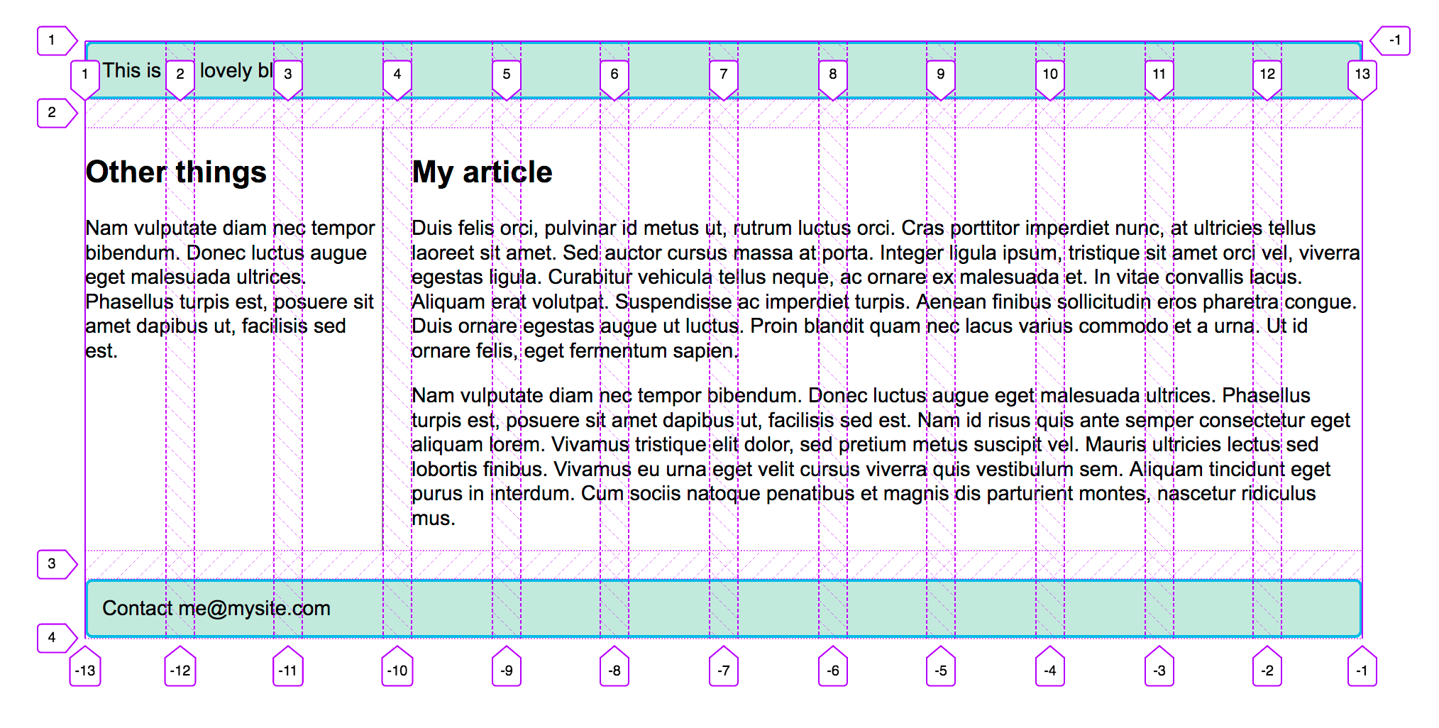
If you use the Firefox Grid Inspector to overlay the grid lines on your design, you can see how our 12-column grid works.
Test your skills!
You’ve reached the end of this article, but can you remember the most important information? You can find some further tests to verify that you’ve retained this information before you move on — see Test your skills: Grid.
Summary
In this overview, we’ve toured the main features of CSS Grid Layout. You should be able to start using it in your designs. To dig further into the specification, read our guides on Grid Layout, which can be found below.
See also
- A list of guides related to the CSS grid layout
- Subgrid guide
- CSS grid inspector: Examine grid layouts on firefox-source-docs
- A complete guide to CSS grid, a visual guide on CSS-Tricks (2023)
- Grid Garden, an educational game to learn and better understand the basics of grid on cssgridgarden.com
- Previous
- Overview: CSS layout
- Next
Found a content problem with this page?
- Edit the page on GitHub.
- Report the content issue.
- View the source on GitHub.
This page was last modified on Oct 18, 2023 by MDN contributors.
Your blueprint for a better internet.
CSS grid layout
The CSS grid layout module excels at dividing a page into major regions or defining the relationship in terms of size, position, and layer, between parts of a control built from HTML primitives.
Like tables, grid layout enables an author to align elements into columns and rows. However, many more layouts are either possible or easier with CSS grid than they were with tables. For example, a grid container’s child elements could position themselves so they actually overlap and layer, similar to CSS positioned elements.
Basic example
The example below shows a three-column track grid with new rows created at a minimum of 100 pixels and a maximum of auto. Items have been placed onto the grid using line-based placement.
* box-sizing: border-box; > .wrapper max-width: 940px; margin: 0 auto; > .wrapper > div border: 2px solid rgb(233 171 88); border-radius: 5px; background-color: rgba(233 171 88 / 0.5); padding: 1em; color: #d9480f; >
HTML
div class="wrapper"> div class="one">Onediv> div class="two">Twodiv> div class="three">Threediv> div class="four">Fourdiv> div class="five">Fivediv> div class="six">Sixdiv> div>
CSS
.wrapper display: grid; grid-template-columns: repeat(3, 1fr); gap: 10px; grid-auto-rows: minmax(100px, auto); > .one grid-column: 1 / 3; grid-row: 1; > .two grid-column: 2 / 4; grid-row: 1 / 3; > .three grid-column: 1; grid-row: 2 / 5; > .four grid-column: 3; grid-row: 3; > .five grid-column: 2; grid-row: 4; > .six grid-column: 3; grid-row: 4; >
Reference
Properties
- display
- grid-template-columns
- grid-template-rows
- grid-template-areas
- grid-template
- grid-auto-columns
- grid-auto-rows
- grid-auto-flow
- grid
- grid-row-start
- grid-column-start
- grid-row-end
- grid-column-end
- grid-row
- grid-column
- grid-area
- row-gap
- column-gap
- gap
- masonry-auto-flow Experimental
- align-tracks Experimental
- justify-tracks Experimental
Functions
Data types
Guides
- Basic concepts of grid layout
- Relationship of grid layout with other layout methods
- Grid template areas
- Grid layout using line-based placement
- Grid layout using named grid lines
- Auto-placement in grid layout
- Box alignment in grid layout
- Grids, logical values, and writing modes
- Grid layout and accessibility
- Realizing common layouts using grids
- Subgrid
- Masonry layout Experimental
Specifications
| Specification |
|---|
| CSS Grid Layout Module Level 2 |
See also
- Glossary terms:
- Grid
- Grid lines
- Grid tracks
- Grid cell
- Grid area
- Gutters
- Grid axis
- Grid row
- Grid column
Found a content problem with this page?
- Edit the page on GitHub.
- Report the content issue.
- View the source on GitHub.
This page was last modified on Jun 15, 2023 by MDN contributors.
Your blueprint for a better internet.
MDN
Support
- Product help
- Report an issue
Our communities
Developers
- Web Technologies
- Learn Web Development
- MDN Plus
- Hacks Blog
- Website Privacy Notice
- Cookies
- Legal
- Community Participation Guidelines
Visit Mozilla Corporation’s not-for-profit parent, the Mozilla Foundation.
Portions of this content are ©1998– 2023 by individual mozilla.org contributors. Content available under a Creative Commons license.Grids
Сетка (grid) — это просто набор горизонтальных и вертикальных линий, создающих шаблон, по которому мы можем выстроить элементы дизайна. Они помогают нам создавать проекты, в которых элементы не прыгают или не меняют ширину при переходе от страницы к странице, обеспечивая большую согласованность на наших сайтах.
В сетке обычно будут столбцы (columns), строки (rows), а затем промежутки между каждой строкой и столбцом, обычно называемые желобами (gutters).
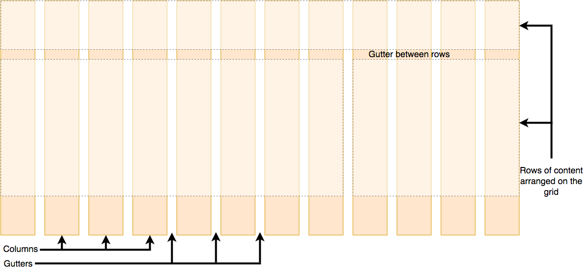
[Временная диаграмма; скоро будет заменена лучшей диаграммой.]
Примечание: Может показаться удивительным, если кто-нибудь из фона дизайна, что CSS не имеет встроенной сетки, и вместо этого мы, похоже, используем множество субоптимальных методов для создания сетчатых конструкций. Как вы узнаете в последней части этой статьи, это изменится, однако вам, вероятно, понадобятся существующие методы создания гридов в течение некоторого времени.
Использование «grid system» в ваших проектах
Чтобы обеспечить постоянный опыт на вашем сайте или в приложении, основываясь на системе сетки с самого начала, вам не нужно думать о том, насколько широкий элемент имеет отношение к другим элементам. Ваш выбор ограничен «количеством столбцов сетки, которые этот элемент будет охватывать».
Ваша «сеточная система» может быть просто решением, принятым в процессе проектирования, для использования регулярной сетки. Если ваши проекты начнутся в приложении для редактирования графики, например Photoshop, вы можете создать сетку для ссылки во время этого процесса, как описано в A better Photoshop grid for responsive web design by Elliot Jay Stocks.
Ваша сетевая система также может быть структурой — либо третьей стороной, либо созданной вами только для вашего проекта, — которую вы используете для обеспечения сетки с помощью CSS.
Создание простых рамок сетки
Мы начнём с рассмотрения того, как вы можете создать простую сетку для вашего проекта.
В настоящее время большинство макетов типа grid создаются с использованием поплавков (floats). Если вы прочитали нашу предыдущую статью о поплавках, вы уже видели, как мы можем использовать эту технику для создания раскладки нескольких столбцов, что является сущностью любой сетки, использующей этот метод.
Самый простой тип структуры сетки для создания фиксированной ширины — нам просто нужно выяснить, сколько общей ширины мы хотим для нашего дизайна, сколько столбцов мы хотим и насколько широки должны быть желоба и столбцы. Если бы вместо этого мы решили выложить наш проект на сетке со столбцами, которые растут и сокращаются в соответствии с шириной браузера, нам нужно будет рассчитать процентную ширину для столбцов и желобов между ними.
В следующих разделах мы рассмотрим, как создать оба. Мы создадим сетку с 12 столбцами — очень общий выбор, который, как видно, очень адаптируется к различным ситуациям, учитывая, что 12 прекрасно делится на 6, 4, 3 и 2.
Простая сетка с фиксированной шириной
Давайте сначала создадим сетку, использующую столбцы фиксированной ширины.
Начните с создания локальной копии нашего образца simple-grid.html файла, который содержит следующую разметку в своём теле.
div class="wrapper"> div class="row"> div class="col">1div> div class="col">2div> div class="col">3div> div class="col">4div> div class="col">5div> div class="col">6div> div class="col">7div> div class="col">8div> div class="col">9div> div class="col">10div> div class="col">11div> div class="col">12div> div> div class="row"> div class="col span1">13div> div class="col span6">14div> div class="col span3">15div> div class="col span2">16div> div> div>
Цель состоит в том, чтобы превратить это в демонстрационную сетку из двух рядов на двенадцать столбцов сетки (grid) — верхний ряд, демонстрирующий размер отдельных столбцов, второй ряд — некоторые области разного размера в сетке.

* box-sizing: border-box; > body width: 980px; margin: 0 auto; > .wrapper padding-right: 20px; >Теперь используйте контейнер строк, который обёрнут вокруг каждой строки сетки, чтобы очистить одну строку от другой. Добавьте следующее правило ниже предыдущего:
.row clear: both; >Применение этого клиринга означает, что нам не нужно полностью заполнять каждую строку элементами, составляющими полные двенадцать столбцов. Строки будут разделены и не будут мешать друг другу.
Желоба между колоннами шириной 20 пикселей. Мы создаём эти желоба в качестве поля в левой части каждого столбца, включая первый столбец, чтобы сбалансировать 20 пикселей прокладки в правой части контейнера. Таким образом, у нас есть 12 водосточных желобов — 12 x 20 = 240.
Нам нужно вычесть это из нашей общей ширины 960 пикселей, что даёт нам 720 пикселей для наших столбцов. Если мы разделим это на 12, мы знаем, что каждый столбец должен быть 60 пикселей в ширину. Наш следующий шаг — создать правило для класса .col , плавающее влево, предоставив ему margin-left из 20 пикселей для формирования желоба и width из 60 пикселей. Добавьте нижеследующее правило в CSS:
.col float: left; margin-left: 20px; width: 60px; background: rgb(255, 150, 150); >Верхний ряд отдельных столбцов теперь будет аккуратно размещаться в виде сетки.
Примечание: Мы также дали каждому столбцу светло-красный цвет, чтобы вы могли точно видеть, сколько места занимает каждый.
В контейнерах макетов, которые мы хотим разместить более одного столбца, нужно предоставить специальные классы, чтобы скорректировать их значения width до необходимого количества столбцов (плюс желоба между ними). Нам нужно создать дополнительный класс, чтобы контейнеры могли охватывать от 2 до 12 столбцов. Каждая ширина является результатом сложения ширины столбца этого количества столбцов плюс ширины желоба, который всегда будет набирать номер меньше, чем число столбцов.
Добавьте нижеследующую часть вашего CSS:
/ * Ширина двух колонок (120 пикселей) плюс одна ширина желоба (20 пикселей) */ .col.span2 width: 140px; > / * Три ширины столбца (180 пикселей) плюс две ширины желоба (40 пикселей) * / .col.span3 width: 220px; > /* И так далее. */ .col.span4 width: 300px; > .col.span5 width: 380px; > .col.span6 width: 460px; > .col.span7 width: 540px; > .col.span8 width: 620px; > .col.span9 width: 700px; > .col.span10 width: 780px; > .col.span11 width: 860px; > .col.span12 width: 940px; >С помощью этих классов мы можем теперь выкладывать разные столбцы ширины в сетке. Попробуйте сохранить и загрузить страницу в своём браузере, чтобы увидеть эффекты.
Примечание: Если вам не удаётся заставить приведённый выше пример работать, попробуйте сравнить его с нашей готовой версией на GitHub (см. также запуск в режиме реального времени).
Попробуйте изменить классы на своих элементах или даже добавить и удалить некоторые контейнеры, чтобы увидеть, как вы можете изменять макет. Например, вы можете сделать вторую строку следующим образом:
"row">
"col span8">13"col span4">14



