Центрирование в CSS: полное руководство
Центрирование элементов — самая популярная причина для жалоб на CSS. «Ну почему нельзя было сделать всё попроще?» — возмущаются все кому не лень. Думаю, проблема не в том, что это сложно сделать, а в том, что способов центрирования элементов такое множество, что бывает трудно выбрать подходящий.
Давайте построим древовидную схему для принятия решения и будем надеяться, что это всё немного упростит.
Мне нужно отцентрировать элемент…
По горизонтали
Является ли элемент строчным или строчно-* (как текст или ссылки)?
Строчные элементы внутри родительского блочного можно центрировать так:
.center-children < text-align: center; > Это сработает для элементов с типом отображения inline , inline-block , inline-table , inline-flex и т.д.
Является ли элемент блочным?
Блочный элемент можно центрировать, указав для margin-left и margin-right значение auto (а также прописав для него конкретный width , иначе он займёт всю ширину родительского контейнера и не будет нуждаться в центрировании). Для этого часто используют сокращённую запись:
.center-me < margin: 0 auto; > Способ работает независимо от ширины центрируемого блочного элемента и его родителя.
Обратите внимание, что заставить элемент плавать по центру с помощью float нельзя. Хотя есть одна хитрость.
Вам нужно центрировать несколько блочных элементов?
Если вы имеете дело с двумя и больше блочными элементами, размещёнными в ряд, которые нужно центрировать по горизонтали, возможно, вам потребуется изменить тип display . Вот что произойдёт, если указать для них тип отображения inline-block или применить flexbox:
В том же случае, если у вас несколько блочных элементов размещены друг над другом, вполне сработает приём с автоматическими отступами:
По вертикали
С вертикальным центрированием в CSS все немного сложнее:
Это элемент строчного типа или строчно-* (как текст или гиперссылки)?
Он помещается в одну строку?
Иногда строчные/текстовые элементы могут выглядеть отцентрированными по вертикали только потому, что у них одинаковые верхнее и нижнее поля ( padding ).
.link < padding-top: 30px; padding-bottom: 30px; > Если использование полей по какой-либо причине невозможно, а вы хотите отцентрировать текст, который точно не будет переноситься в следующую строку, можно использовать хитрость с установкой line-height равной высоте элемента, это отцентрирует текст:
.center-text-trick < height: 100px; line-height: 100px; white-space: nowrap; > Элемент занимает несколько строк?
Центрирование нескольких строчек текста также можно сделать с помощью установки одинаковых верхнего и нижнего полей, однако, если этот вариант вам не подходит, можно сделать элемент, в который помещён текст, ячейкой таблицы — буквально или же просто её имитацией на CSS. За центрирование в этом случае отвечает свойство vertical-align , несмотря на то, что обычно он просто выравниванивает по горизонтали элементы в ряду. (Более подробно об этом.)
Если вы имеете дело с некоей имитацией таблицы, может быть, стоит использовать flexbox? Один дочерний flex-элемент можно довольно легко отцентрировать во flex-родителе.
.flex-center-vertically < display: flex; justify-content: center; flex-direction: column; height: 400px; > Помните, что этот способ подходит только если у родительского контейнера указана конкретная ширина (px, % и т.д.), поэтому здесь у контейнера есть высота.
Если оба этих способа не подходят, можно использовать приём «элемент-призрак», при котором в контейнер помещается псевдоэлемент с максимальной высотой, и текст выравнивается по горизонтали по этому элементу:
.ghost-center < position: relative; > .ghost-center::before < content: " "; display: inline-block; height: 100%; width: 1%; vertical-align: middle; > .ghost-center p < display: inline-block; vertical-align: middle; > Это блочный элемент?
Вам известна высота элемента?
Обычно, когда речь идёт о веб-странице, высота может быть неизвестна по многим причинам: если изменяется ширина элемента, перераспределение текста может изменить высоту. Вариации в стилизации текста могут изменить высоту. Изменение количества текста может изменить высоту элемента. Элементы с фиксированным соотношением сторон, например, изображения, могут изменить высоту при масштабировании — и так далее.
Но, если вам известна высота, вертикальное центрирование можно сделать так:
.parent < position: relative; > .child < position: absolute; top: 50%; height: 100px; margin-top: -50px; /* учитывайте поля и границы, если не используете box-sizing: border-box; */ > Вам неизвестна высота элемента?
Его все-таки можно центрировать, подняв вверх на половину его высоты после того, как сдвинули его наполовину вниз:
.parent < position: relative; > .child < position: absolute; top: 50%; transform: translateY(-50%); > Вы можете использовать flexbox?
Не удивительно, что всё это можно сделать значительно проще с помощью flexbox.
.parent < display: flex; flex-direction: column; justify-content: center; > И по горизонтали, и по вертикали
Описанные выше приёмы можно комбинировать как угодно, чтобы получить идеально отцентрированные элементы. Но, по моему опыту, обычно всё сводится к трём вариантам:
У элемента фиксированная высота и ширина?
Использование отступов с отрицательными значениями, равными половине высоты и ширины элемента после того, как для него было прописано абсолютное позиционирование в точке 50%/50%, отцентрирует элемент внутри родителя. Кроме того, способ хорошо поддерживается браузерами:
.parent < position: relative; > .child < width: 300px; height: 100px; padding: 20px; position: absolute; top: 50%; left: 50%; margin: -70px 0 0 -170px; > Высота и ширина элемента неизвестны?
Если вам не известны ширина или высота, для центрирования можно использовать свойство transform и отрицательное значение translate по 50% в обоих направлениях (оно вычисляется от текущей ширины/высоты элемента):
.parent < position: relative; > .child < position: absolute; top: 50%; left: 50%; transform: translate(-50%, -50%); > Вы можете использовать flexbox?
Чтобы выполнить центрирование в обоих направлениях с помощью flexbox, нужно использовать два центрирующих свойства:
.parent < display: flex; justify-content: center; align-items: center; > Заключение
С помощью CSS вы можете отцентрировать всё что угодно.
CSS Positioning – Position Absolute and Relative Example
Dionysia Lemonaki
When you want to design complex layouts, you’ll need to change the typical document flow and override the default browser styles.
You have to control how elements behave and are positioned on the page.
For example, you may want to stack elements next to each other or on top of one another in a specific way or make a header «stick» to the top of the page and not move when you scroll up and down the page.
To do the above, and much more, you’ll use CSS’s position property.
This property takes in five values: static , relative , absolute , fixed , and sticky .
In this article, we’ll focus on the relative and absolute values.
We’ll see an overview of how they work, their differences from one another, and how they are best used in conjunction for maximum effect.
Let’s get started!
How to view the position of elements using Chrome Developer Tools
A useful tool in your front end web development workflow is Chrome’s Developer Tools.
Among many things, you have the ability to look at the HTML/CSS/JavaScript code of any website to understand how different styles work.
To see what position an element has on a web page on a Mac machine, press Control and click at the same time while on the desired element. On a Window’s machine, right click on the element you want to select.
A menu will then appear and from there select Inspect .
The Chrome Developer Tools will open.
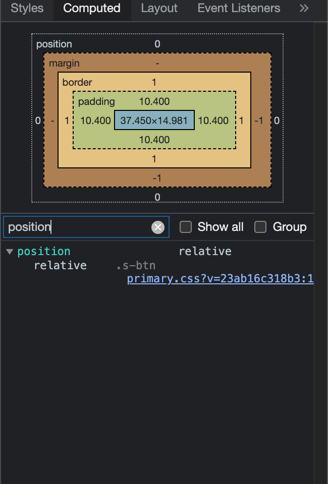
Select the Computed tab and from there either scroll down to the position element or in the filter search box, type in position .
What is the default position of HTML elements in CSS?
By default, the position property for all HTML elements in CSS is set to static . This means that if you don’t specify any other position value or if the position property is not declared explicitly, it’ll be static .
Visually, all elements follow the order of the HTML code, and in that way the typical document flow is created.
Elements appear one after the other – directly below one another, according to the order of the HMTL code.
Block elements like are stacked one after the other like this:
CSS Positioning One Two Three Four body < margin: 100px auto; >.parent < width: 500px; border: 1px solid red; margin: auto; text-align: center; >.child < border-radius: 10%; width: 100px; height: 100px; margin: 20px; >.one < background-color: powderblue; >.two < background-color: royalblue; >.three < background-color: sienna; >.four
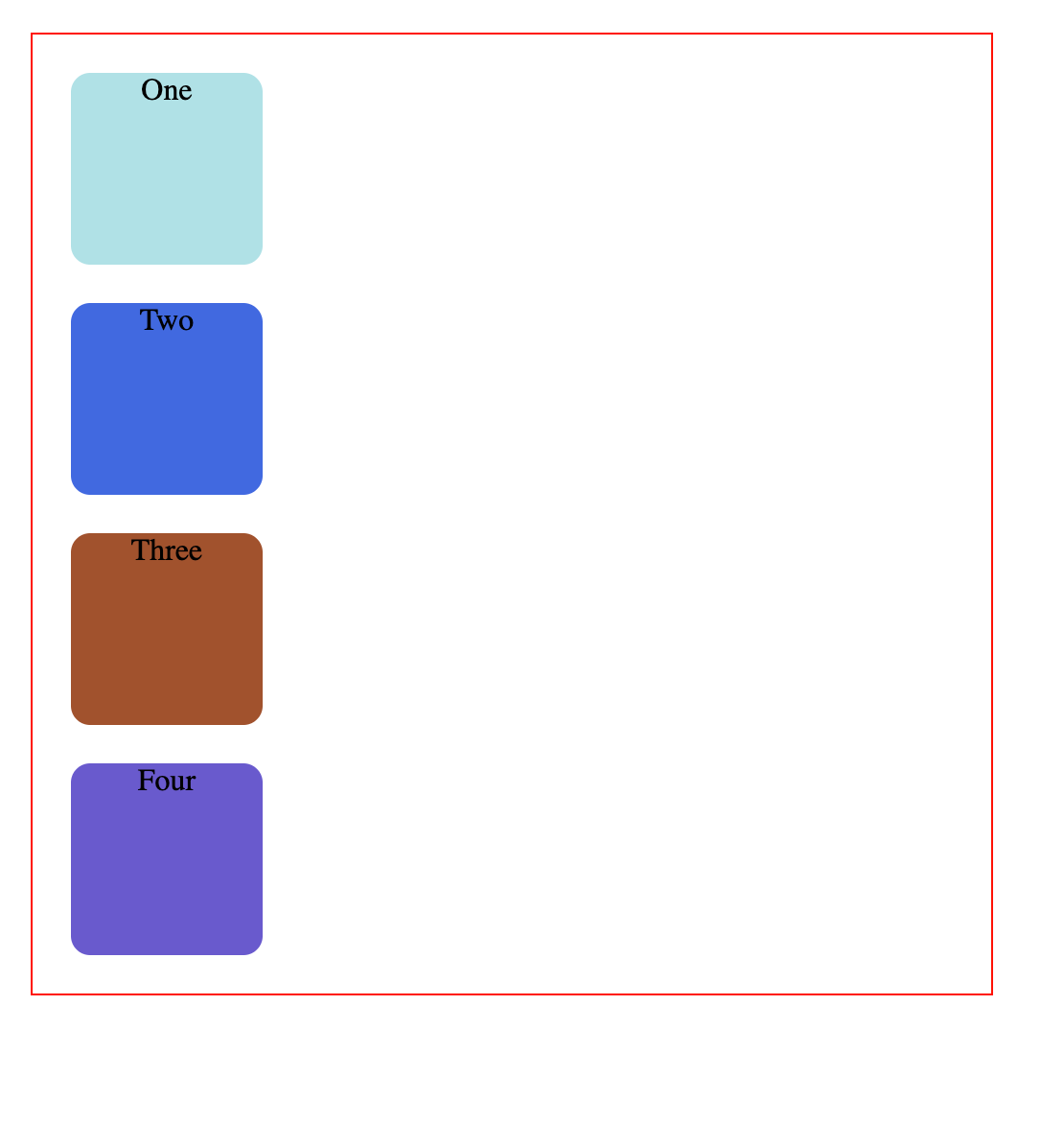
The position property isn’t declared in the above code and it therefore reverts to the default position: static . It follows the order of the HTML code.
Whatever comes first in the HTML is shown first, and each element follows the next, creating the document flow as I described above.
In our code here, the div with the text «One» is written first so it is shown first on the page. Directly below that, the box with the text «Two» is shown, since it also comes next in the HTML, and so on.
This default positioning doesn’t leave any room for flexibility or to move elements around.
What if you wanted to move the first square a bit towards the left of the page – how would you do that?
There are offset properties to do so, like top , bottom , right and left .
But if you try to apply them while the square has this default static position applied to it, these properties will do nothing and the square will not move.
These properties have no effect on position: static .
What is position relative in CSS?
position: relative works the same way as position: static; , but it lets you change an element’s position.
But just writing this CSS rule alone will not change anything.
To modify the position, you’ll need to apply the top , bottom , right , and left properties mentioned earlier and in that way specify where and how much you want to move the element.
The top , bottom , right , and left offsets push the tag away from where it’s specified, working in reverse.
top in fact moves the element towards the bottom of the element’s parent container. bottom pushes the element towards the top of the element’s parent container, and so on.
Now, you can move the first square to the left by updating the CSS like this:
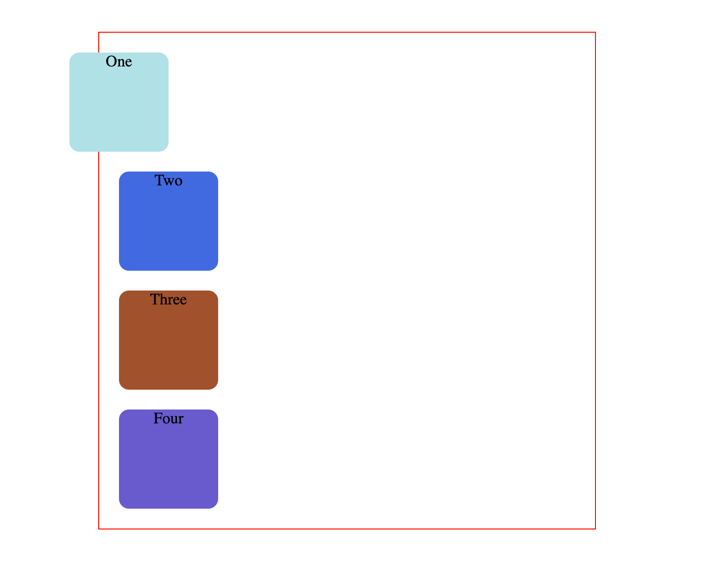
Here, the square has moved 50px from the left of where it was supposed to be by default.
position: relative; changes the position of the element relative to the parent element and relative to itself and where it would usually be in the regular document flow of the page. This means that it’s relative to its original position within the parent element.
It moves the tag based on where it currently is, relative to its usual place and relative to its surrounding tags without affecting their layout.
Using these offsets and position: relative , you can also change the order in which elements appear on the page.
The second square can appear on top of the first one:
.one < background-color: powderblue; position: relative; top: 150px; >.two
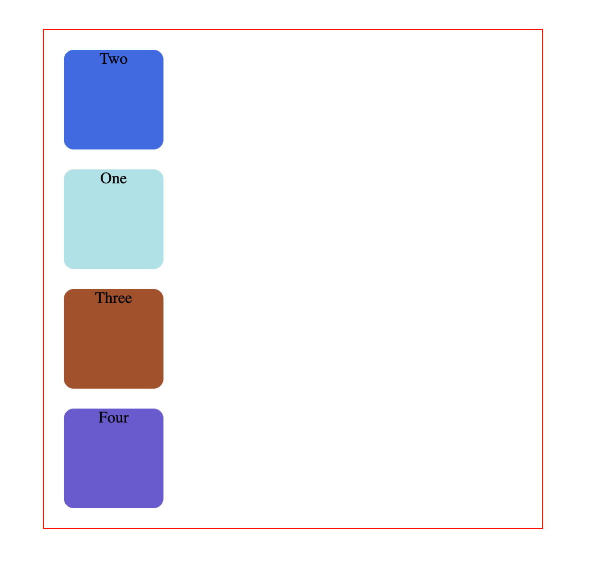
Visually the order is now reversed, while the HTML code remains exactly the same.
To recap, elements that are relatively positioned can move around while still remaining in the regular document flow.
They also do not affect the layout of the surrounding elements.
What is position absolute in CSS?
If you update the CSS rule for the first square to the following:
You’ll get this result:
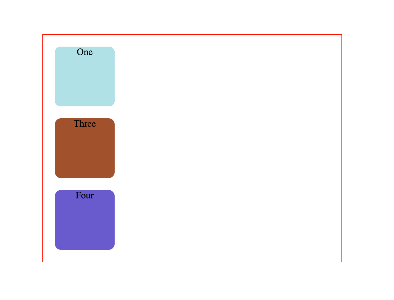
This is unexpected behavior. The second square has completely disappeared.
If you also add some offset properties like this:
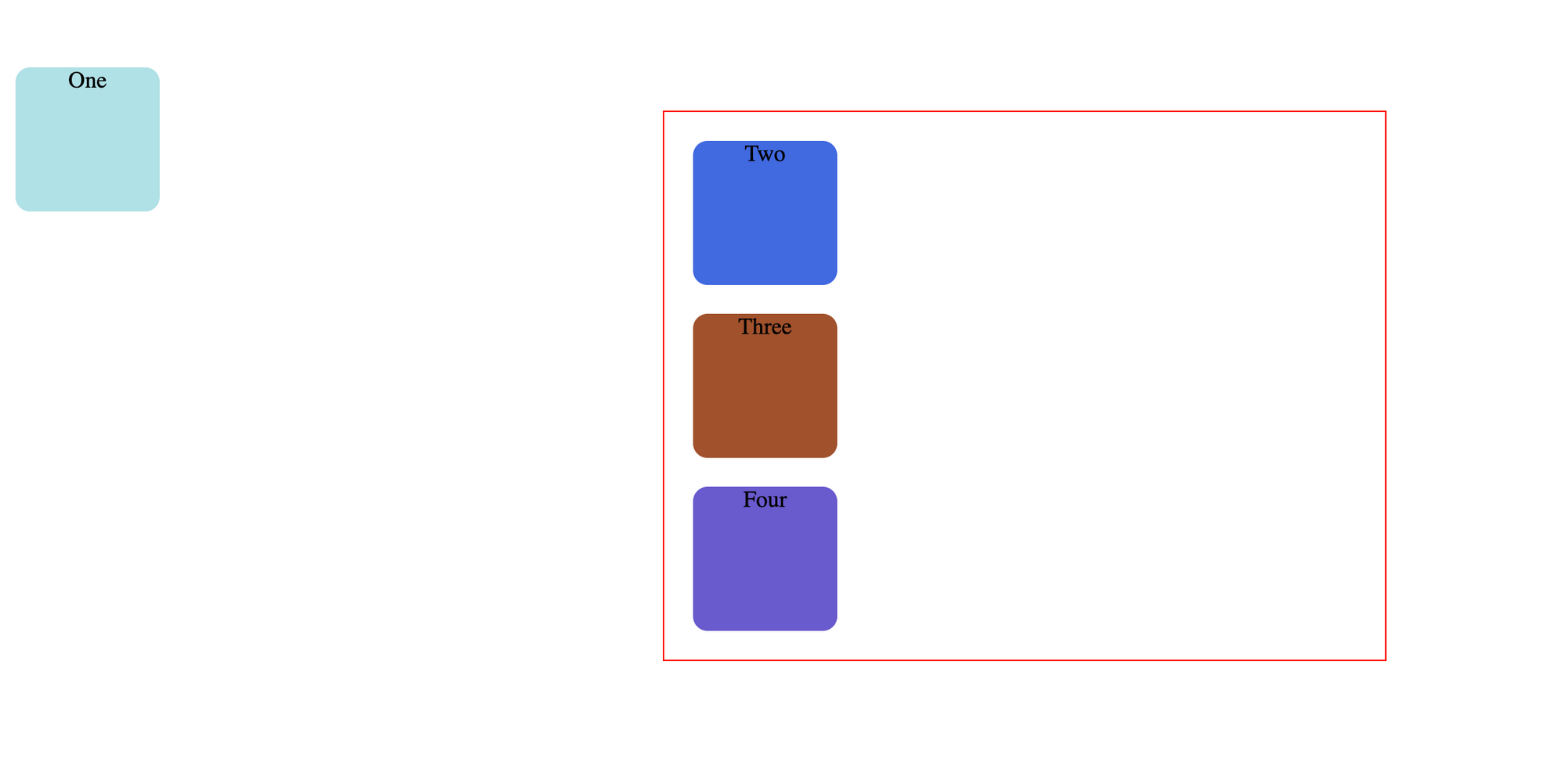
Well now the square has completely abandoned it’s parent.
Absolute-positioned elements are completely taken out of the regular flow of the web page.
They are not positioned based on their usual place in the document flow, but based on the position of their ancestor.
In the example above, the absolutely positioned square is inside a statically positioned parent.
This means it will be positioned relative to the whole page itself, which means relative to the element – the root of the page.
The coordinates, top: 50px; and left: 0; , are therefore based on the whole page.
If you want the coordinates to be applied to its parent element, you need to relatively position the parent element by updating .parent while keeping .one the same:
.parent < width: 500px; border: 1px solid red; margin: auto; text-align: center; position: relative; >.one
This code creates the below result:
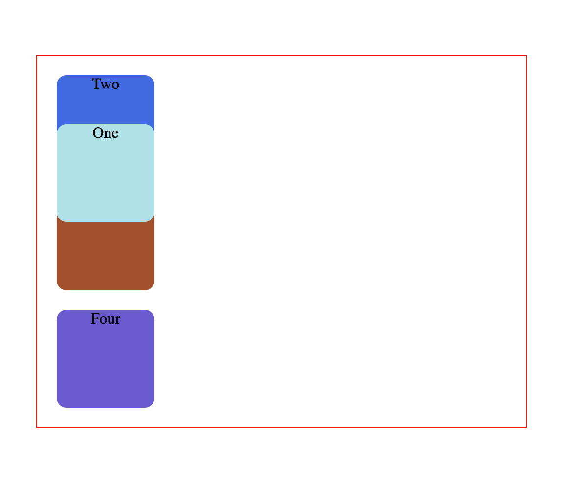
Absolute positioning takes elements out of the regular document flow while also affecting the layout of the other elements on the page.
Conclusion
Hopefully now you have a better understanding of how relative and absolute positioning work.
If you are interested in learning more about HTML and CSS, you can save and work through this playlist on freeCodeCamp’s YouTube channel.
It includes videos to help you get started from scratch, and it’ll help you gain a good grasp of the fundamentals.
freeCodeCamp also offers a free and interactive project based Responsive Web Design Certification, which is a great place to start your front end web development journey.
Thanks for reading and happy learning!
Absolute Positioning Using CSS
We can define positioning of an element in CSS as absolute which renders the element relative to the first positioned (except static) parent. Elements with positioning method as absolute are positioned by CSS Positioning properties (left, right, top and bottom).
The position property has the following values −
Here is how we position an element with absolute positioning, relative to the first positioned parent −
We need to set absolute positioning. For that, use the position property −
position: absolute;
Positioned Elements as Absolute
Example
In this example, we have postioned the paragraph tag as absolute −
p < margin: 0; position: absolute; top: 50%; left: 50%; transform: translate(-50%, -50%); >div:first-child < background-color: orange; text-align: center; >div:last-childDemo textICC is International Cricket Council is the governing body of Cricket founded in 1909.
Positioned Elements as Absolute, Relative and Fixed
Example
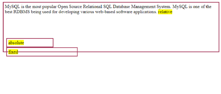
In this example, we have shown how elements are positioned using the position property in CSS −
MySQL is the most popular Open Source Relational SQL Database Management System. MySQL is one of the best RDBMS being used for developing various web-based software applications. relativeabsolutefixed
What are Absolute and Relative Units in CSS? Explained with Examples

Dillion Megida
In CSS, we categorize measurement units as either absolute or relative units. In this article, I’ll explain what these categories are with examples of units that fall under each of them.
CSS Measurement Units
You can use different measurement units in CSS. You use these units with length or size values and they can be associated with properties like font-size , width , border-width , padding , and so many more.
When using font-size , you specify a value for the size of the font.
You also specify a length for the width of an element.
And with padding, you specify a length.
These values have units that help CSS understand what length or size their elements should be on the screen. And as I mentioned in the beginning of the article, we can categorize these values into Absolute and Relative units.
What are Absolute Units?
Absolute units specify a fixed length value. It doesn’t matter if the screen’s width or height changes, the value will remain fixed.
Units that fall under this category include:
mm (millimeters)
cm (centimeters): 10mm makes 1cm
in (inches): 2.54cm makes 1in
pt (points): 1/72in makes 1pt
pc (picas) – 12pt makes 1pc
px (pixel)– 0.75pt makes 1px
For high-resolution media like print documents, it is recommended that you use cm , mm , or pt . For webpages, px is the recommended unit.
Here is an example:
Hello On a full screen, here is the result:

When the screen becomes smaller, the div still maintains a 300px width because it is a fixed value:

The width of the block is not relative to anything, so regardless of other size changes, the DOM is still going to try to maintain that 300px width as much as possible.
What are Relative Units?
Unlike absolute units, relative units are not fixed. Their values are «relative» to another value. This means that when that other value changes, the relative unit value will also change.
Units that fall under this category include:
% (percentage): relative to the size of the parent element
em (font size): relative to the size of the font
rem (root em ): relative to the font size of the root element
vw (viewport width): relative to the width of the viewport
vh (viewport height): relative to the height of the viewport
You can see how values with these units are relative to another value. Here’s an example:
Hello .container < width: 300px; border: 2px solid black; padding: 20px; >.card

From the above, you see that the .container div is 300px (fixed). But the .card div is 60% width, which means 60% of the width of its parent element. So you have 60% of 300px, and that results in the .card div having a width of 180px .
If the width of the .container div changes, the .card div will also change.
Here’s another example using vw :
.container < width: 100vw; background-color: blue; padding: 10px; >.card
Here is the result:

Here, you can see that the .container div is 100vw width, which means 100% of the viewport width. The .card div is 80vw width and 90vh height, which means 80% of the viewport width and 90% of the viewport height.
When you reduce the size of the viewport, these relative values will adjust:

Here, I have reduced the width and height of the viewport, and so the relative values applied on .container and .card are adjusted also.
The em unit can mean two things: in the context of typography, it means «relative to the parent element’s font size» and in the context of size properties like widths and heights, it means «relative to the current element’s font size«.
Let’s see an example:
I am a text
.container < font-size: 16px; >.text
Here’s the result:

I’ll explain what happened in the result above.
The .container div has a font-size of 16px .
The .text p has a font-size of 2em . Since this is typography, it means «the font size is 2 times the parent’s font-size«, so it is 32px .
The p tag also has a width of 3em . Since this property doesn’t fall under typography, it means «the width is 3 times the font-size of the element itself«. The font-size is 32px , so the width will be 96px .
rem on the other hand, in both contexts, means «relative to the root element’s font size«. Here’s an example:
I am a text
html < font-size: 20px; >.container < width: 5rem; border: 1px solid green; >.text
Here is the result:

The root element has a font-size of 20px . Here are the calculations for the relative units in the CSS:
- .container div has a width of 5rem which is 5 times 20px and that is 100px
- .text p has a:
- font-size of 0.5rem which is 1/2 of 20px and that is 10px
- width of 2rem which is 2 times 20px and that is 40px
- padding of 1rem which is 1 times 20px and that is 20px
Wrapping up
Units are a value of measurement in CSS, which helps CSS determine what length/size values will be applied to size-based properties.
In this article, we’ve looked at the two categories of units which are Absolute and Relative.
As a recap, Absolute units are used for fixed values. These values do not change regardless of changes in the sizes of the surrounding elements or the viewport.
Relative units, on the other hand, are used for values that are relative to – or depend on – values of other elements (usually the parent, the viewport, or the root element).